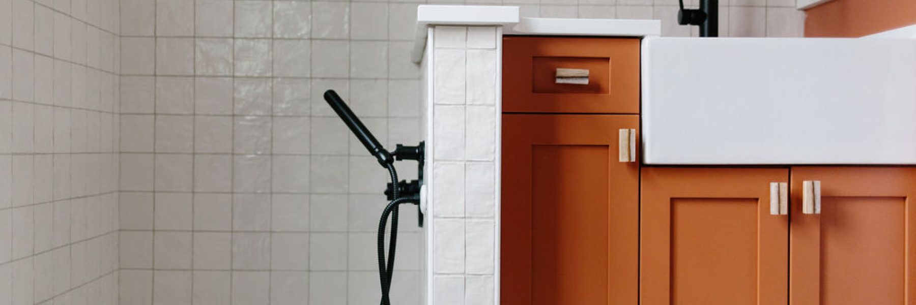
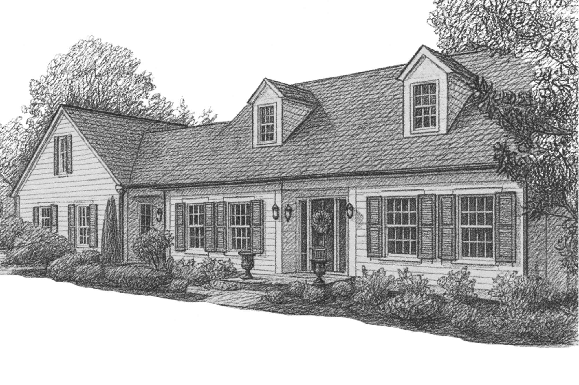
At the beginning of our business we spent the majority of our time flipping houses. We loved unique and bold designs. And I (Claude) especially enjoyed picking out one color and incorporating it throughout the project. Sometimes in the kitchen cabinets, the bathroom tile, an accent wall, the exterior of the building. Whatever it was, I would work to incorporate one unique color throughout the house.
THE ONE THAT WE CHOSE PINK
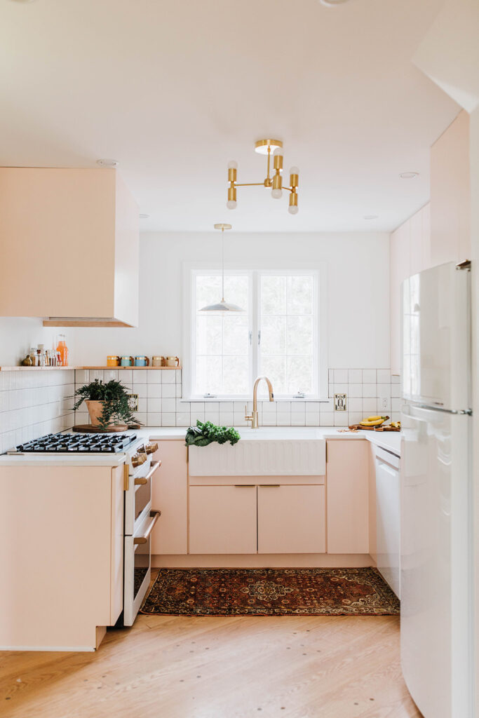
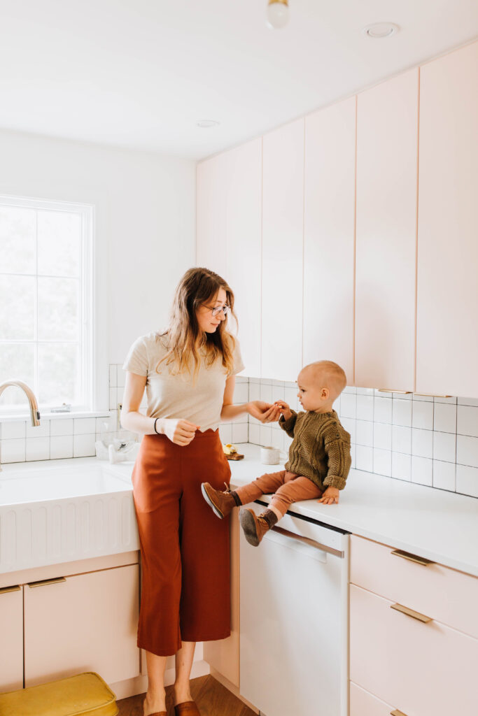
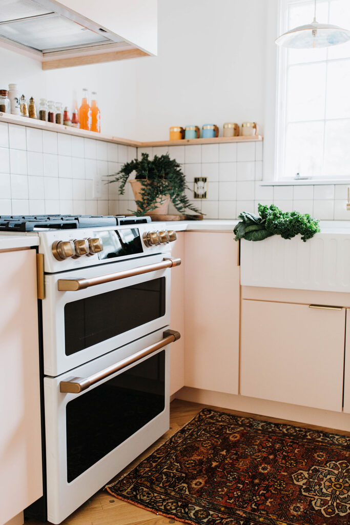
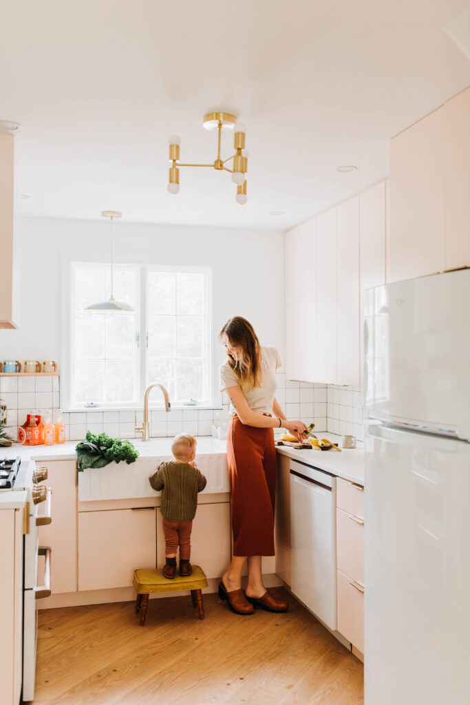
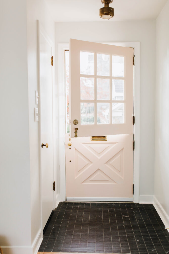
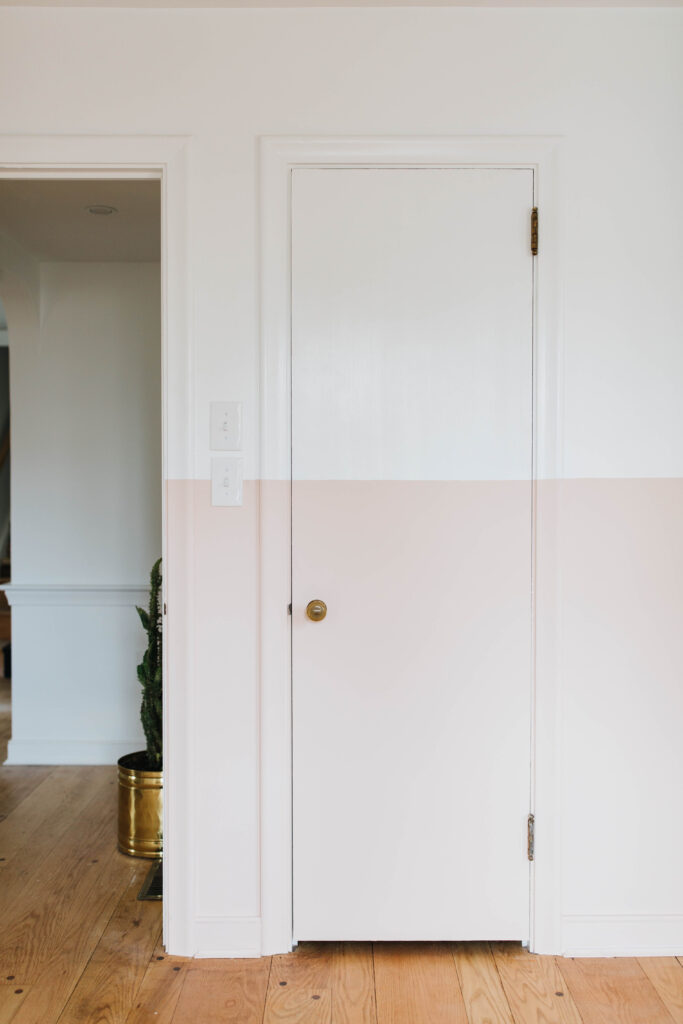
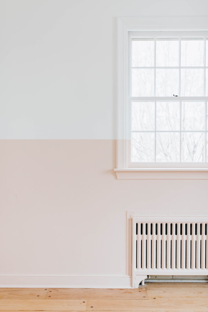
We understand that pink might be more of a controversial color to use everywhere. But, as you probably already know, I don’t mind picking a controversial design element. And when it’s a soft pink like this one, how can you not love it! This exact color was called Pink Ground by Farrow and Ball. We chose it because its subtle and soft, it doesn’t scream pink at you and yet it can stand by itself. And be honest, the kitchen did turn out cute.
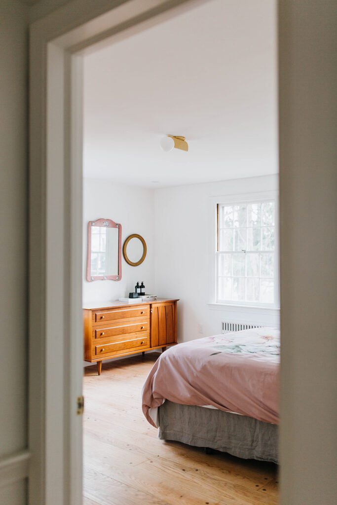
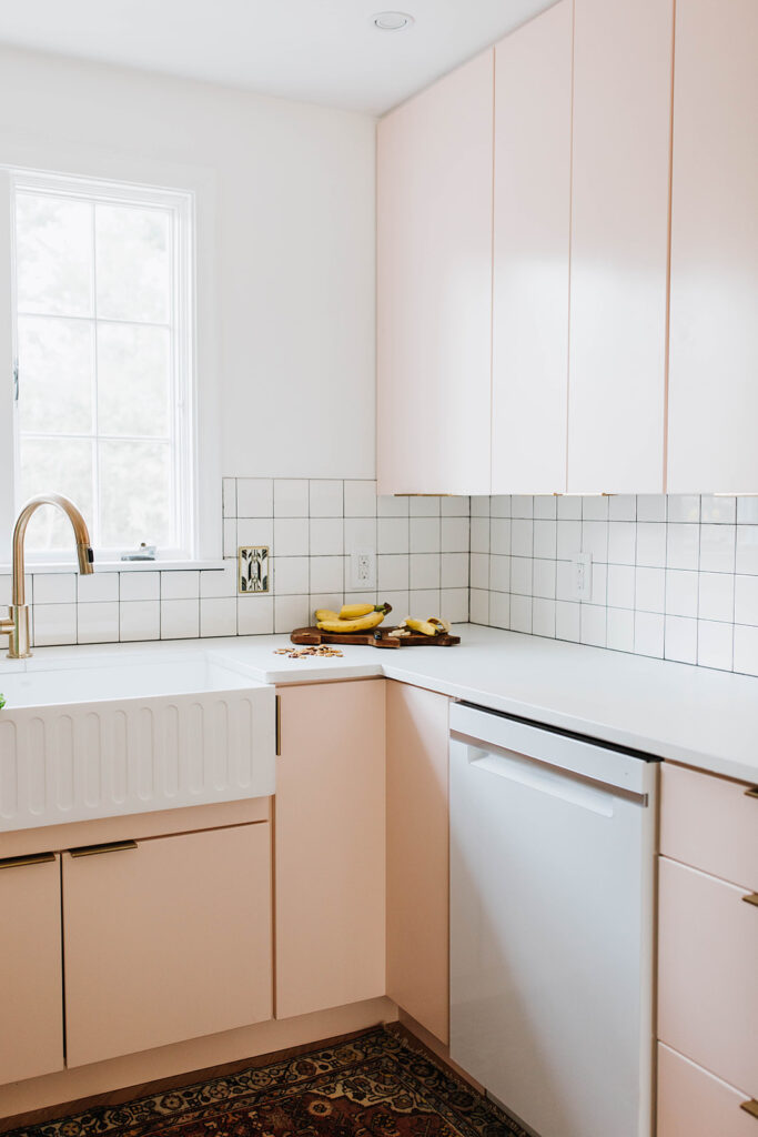
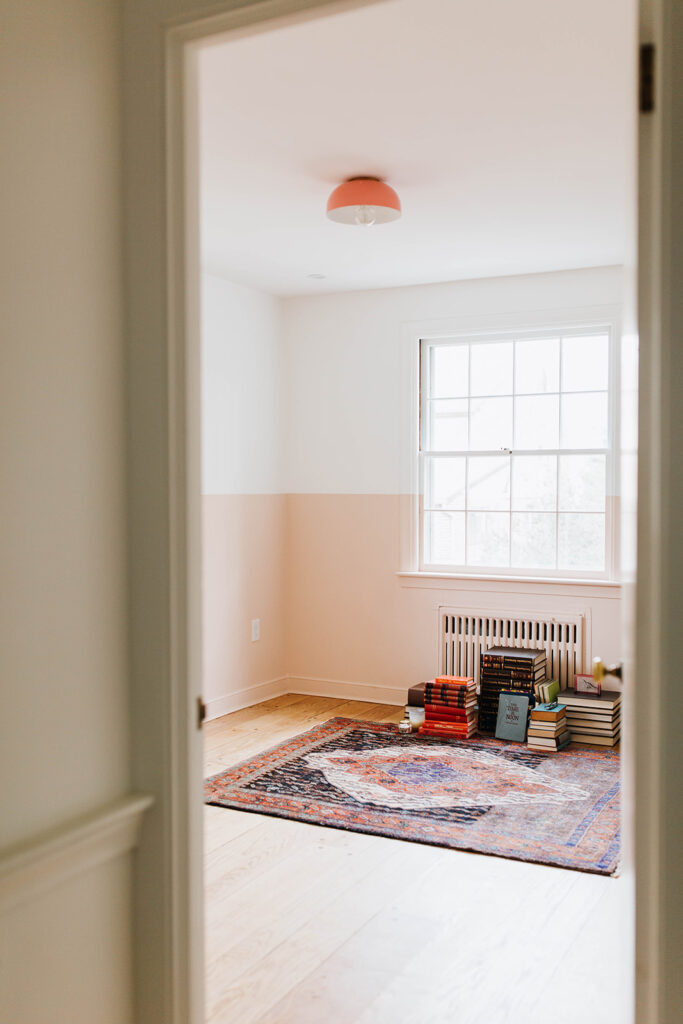
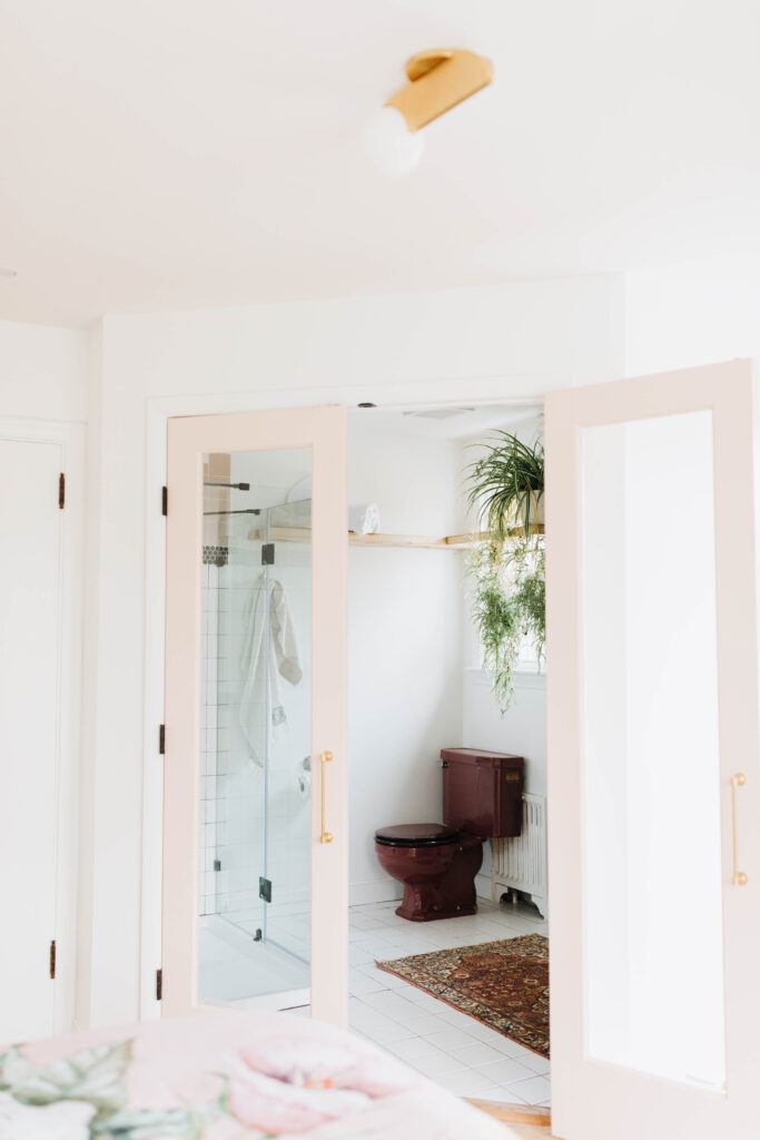
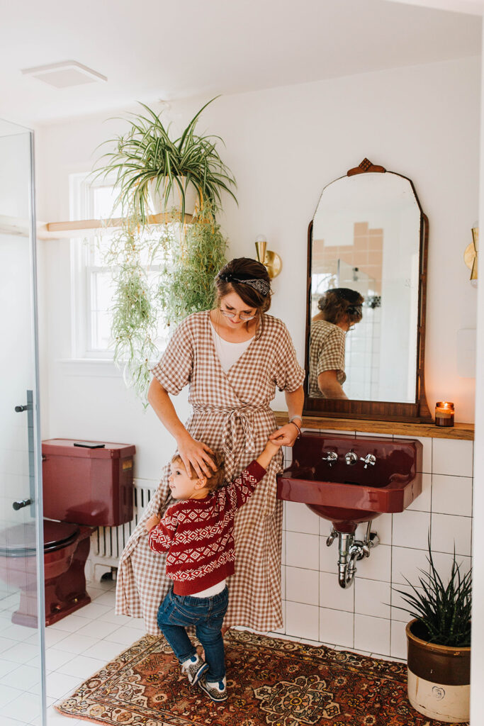
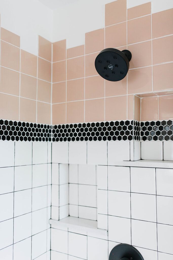
We even kept the maroon toilets and installed pink tile to incorporate the color in the bathrooms. We’ll admit that keeping the old toilet was a mistake (we wished later we had replaced them for newer, more economical toilets) but we’ll always look back on this look fondly.
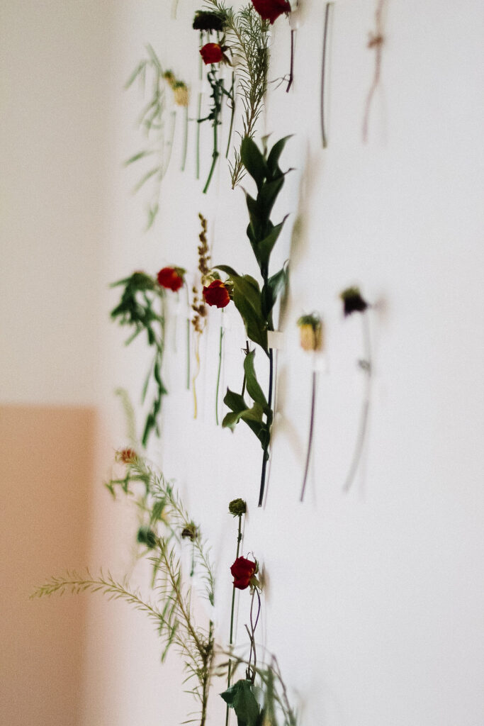
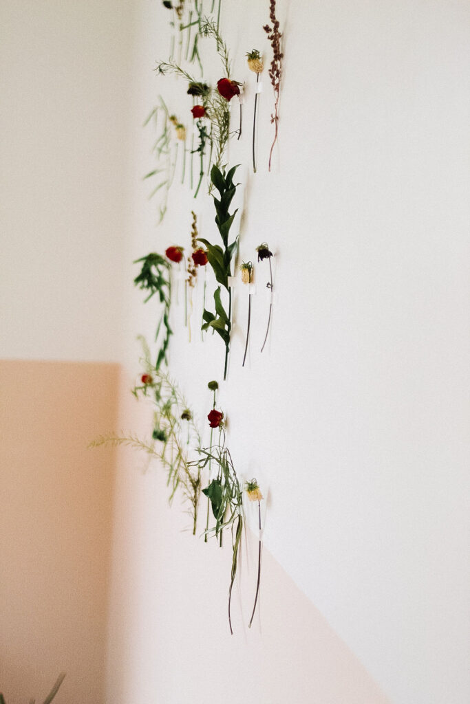
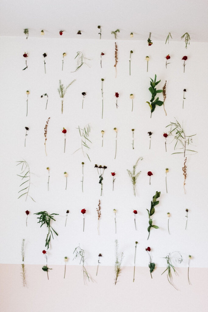
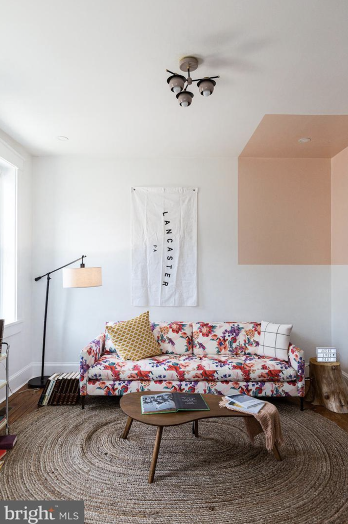
We painted one room white and pink. Incorporating the pink color about half way up the wall. And then we taped these flowers all of the wall and even onto the ceiling. It’s a simple way to add something to a wall without breaking the bank.
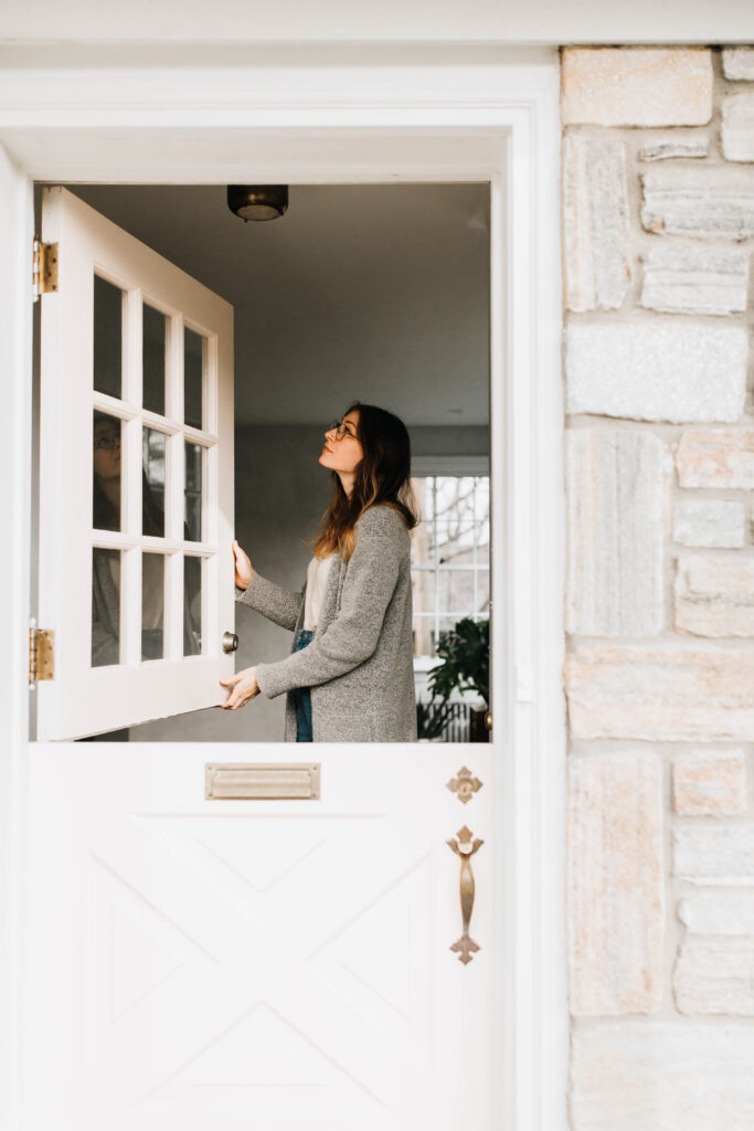
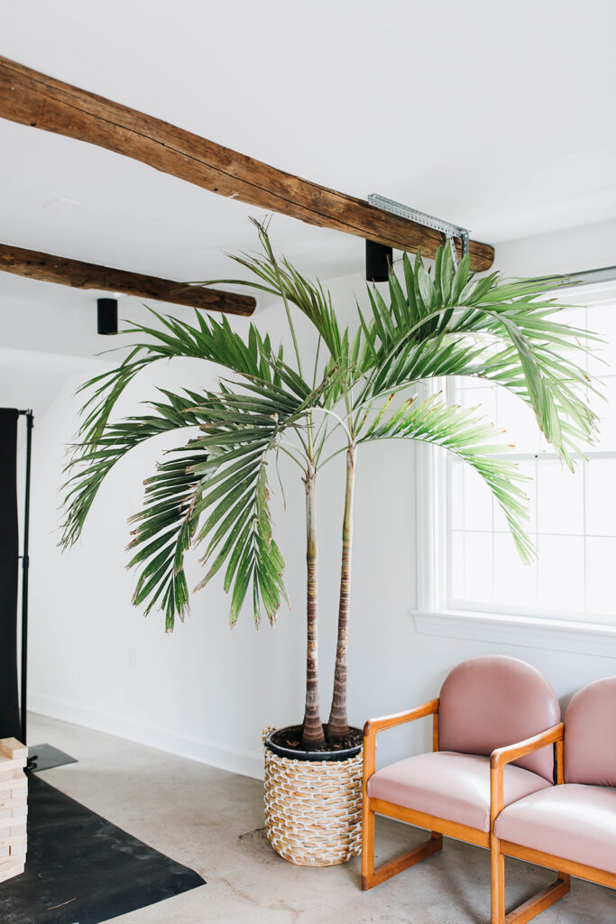
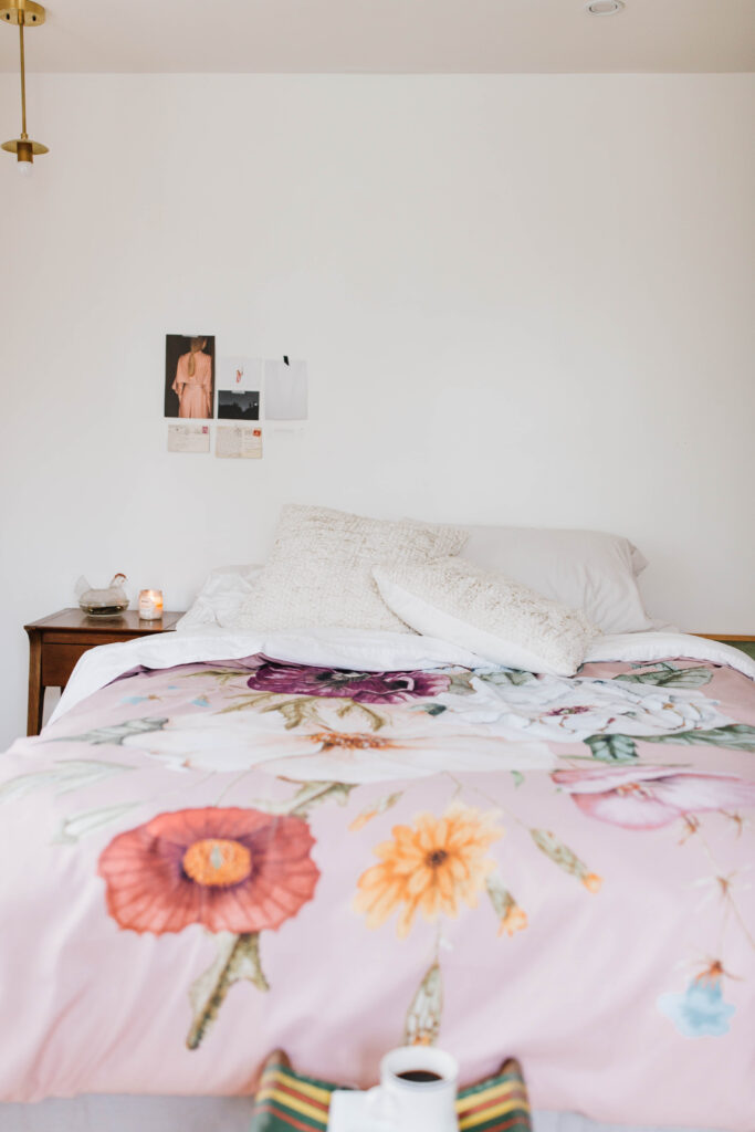
In the end, we painted walls half pink, painted cabinets pink, installed pink tile, bought pink chairs, kept a pink-ish (we know it’s maroon) toilet and sink, painted the doors pink, bought pink bedding and overall fell in love with the finish of the pink color. You can check out the entire project gallery here. (Including the before photos and the links to many of our resources – you won’t want to miss it.)
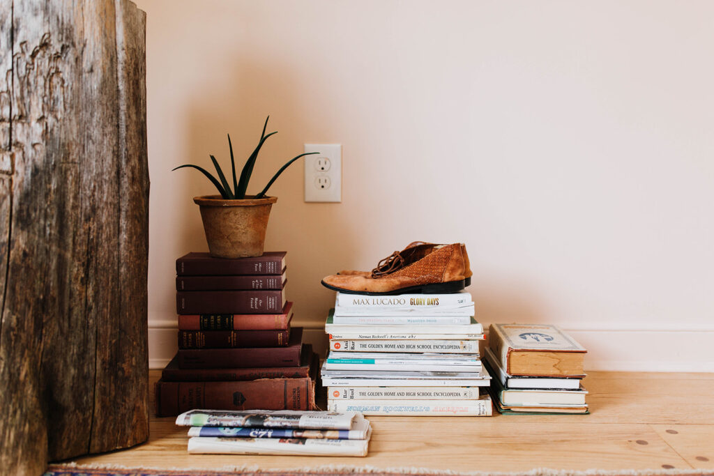
“And I started to wonder why we aren’t just doing nice little renovations without so much fuss. I pondered it for a while before approaching Chris with it and he said, ‘well God made the Cardinals red.'”
Claude
THE ONE THAT WE CHOSE PEAR
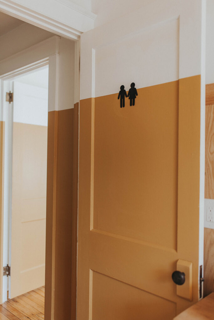
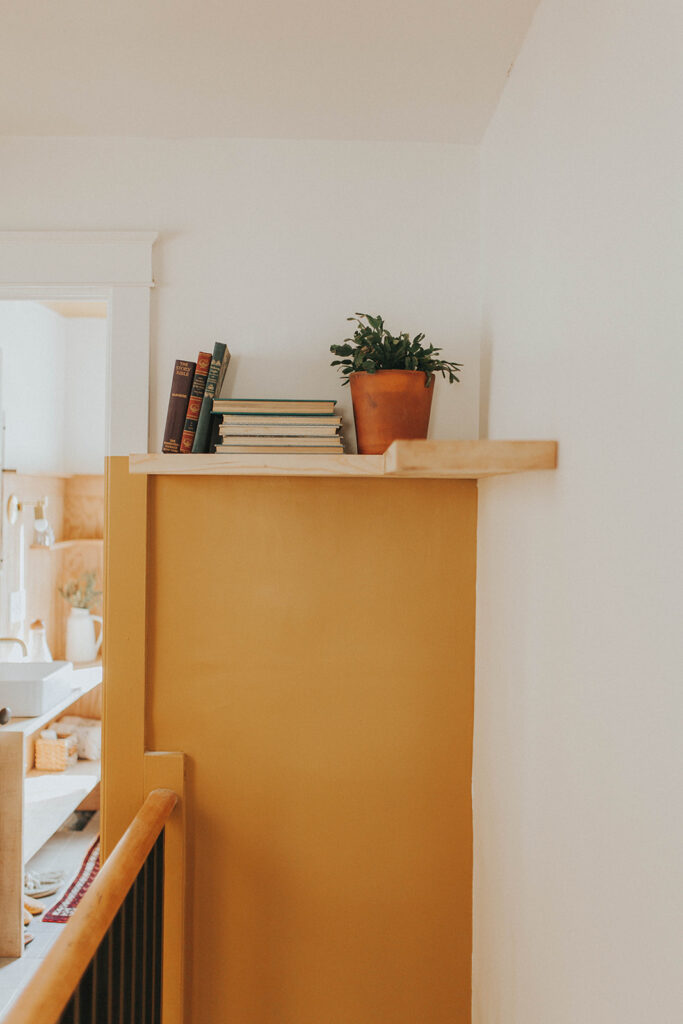
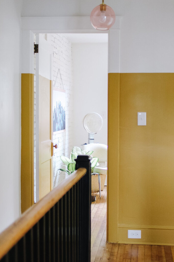
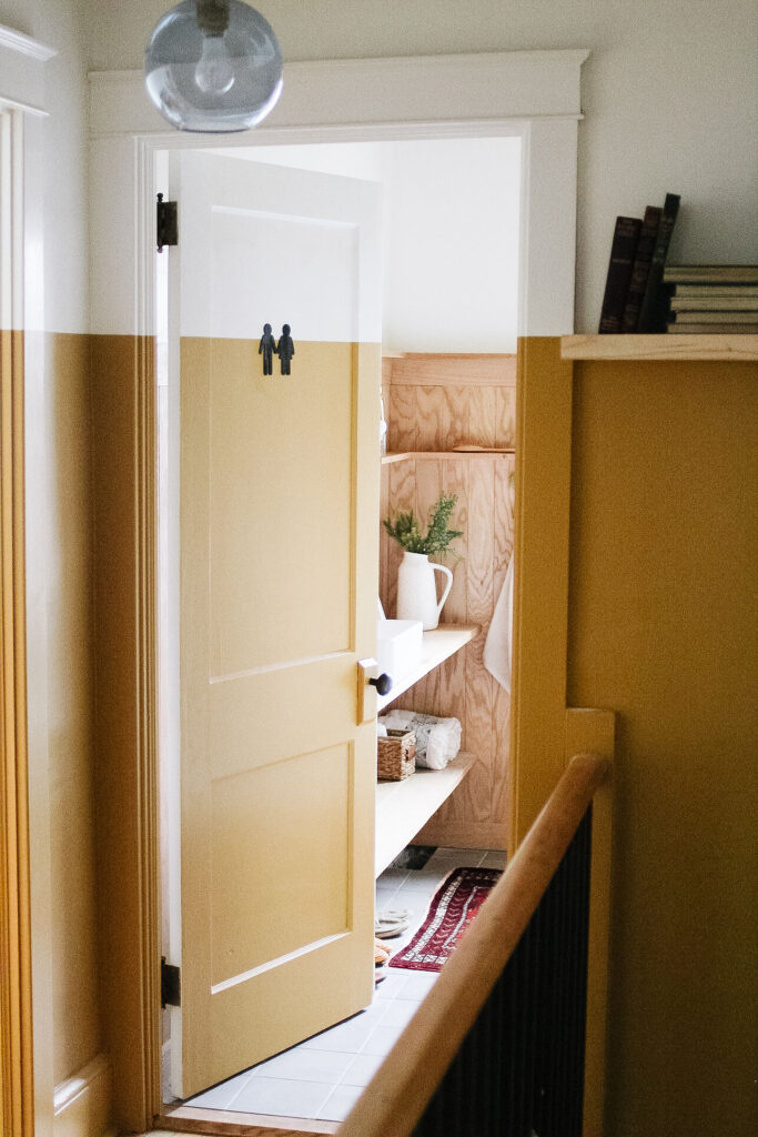
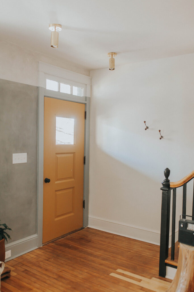
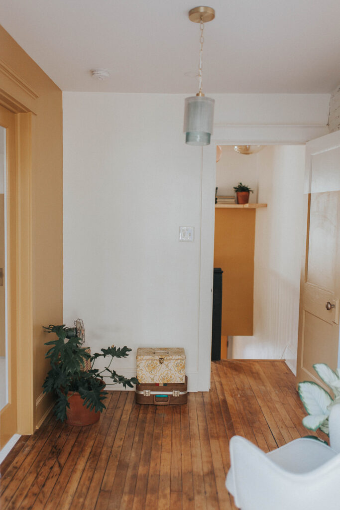
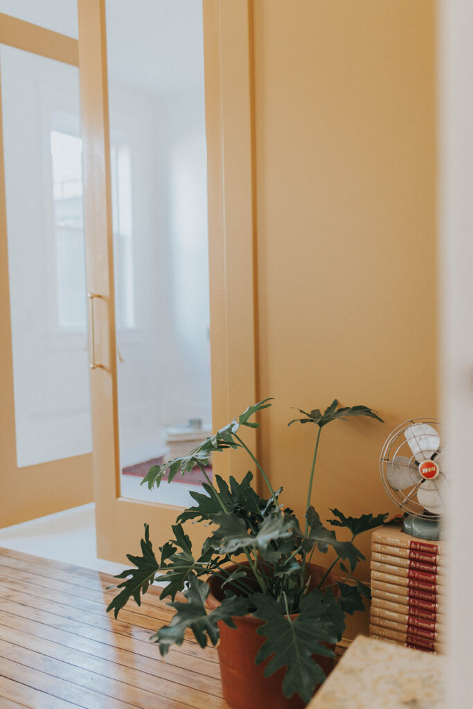
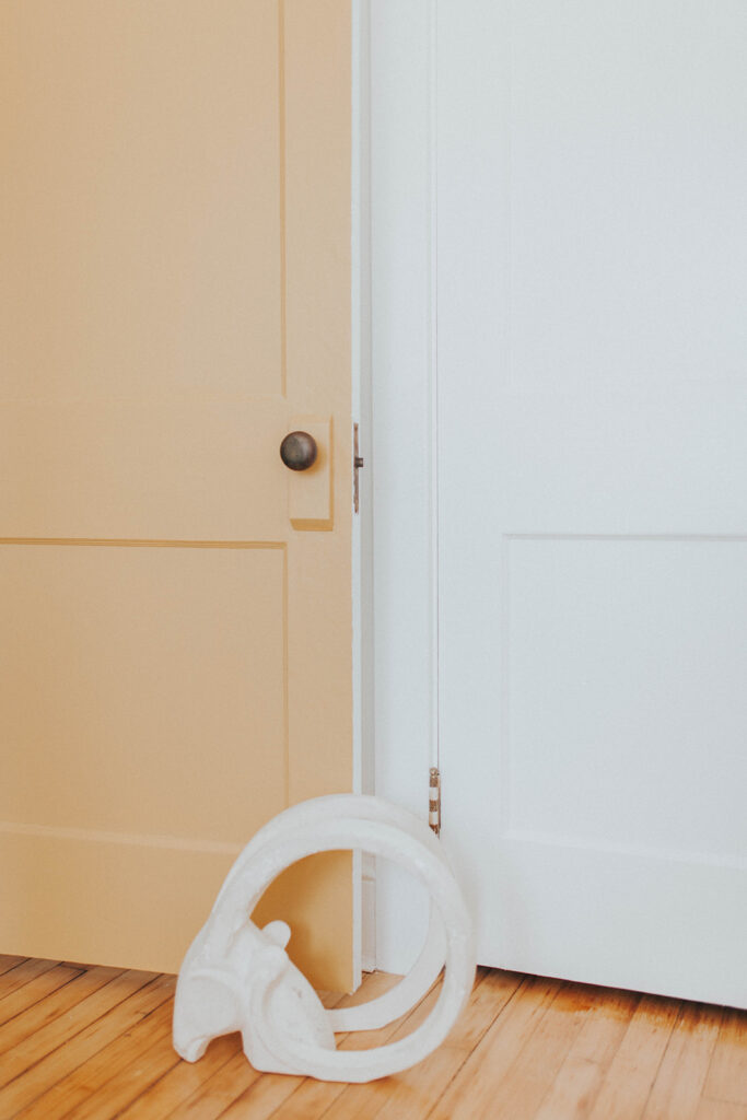
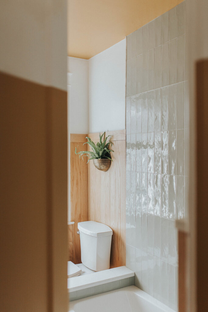
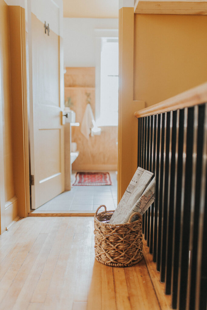
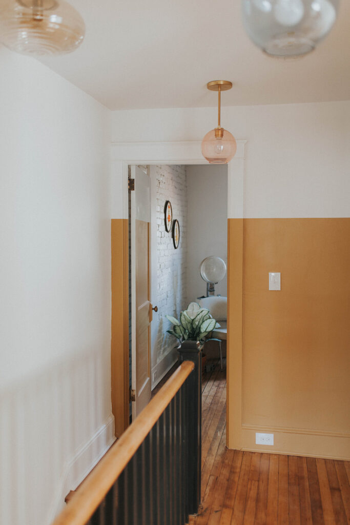
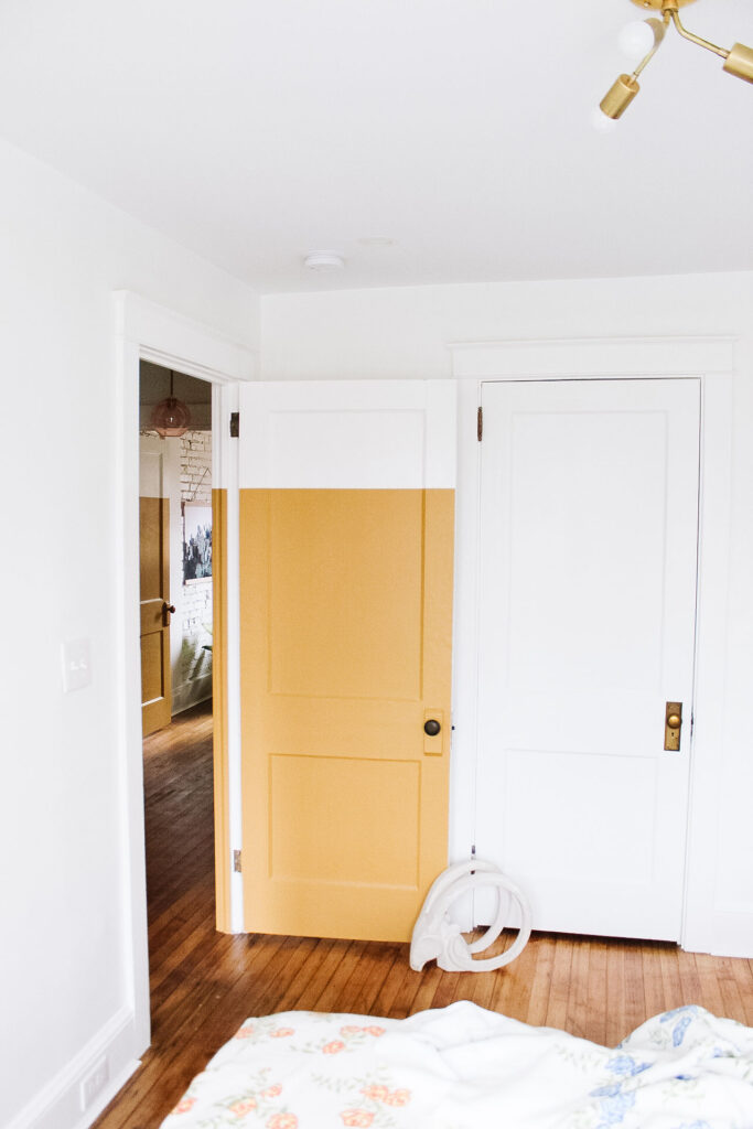
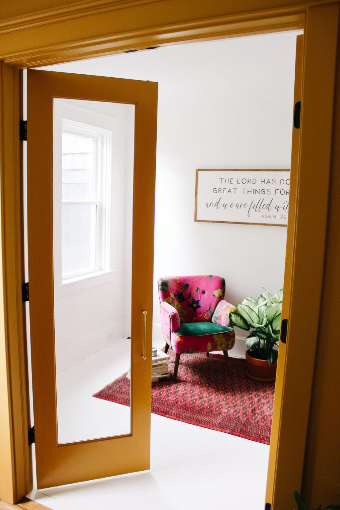
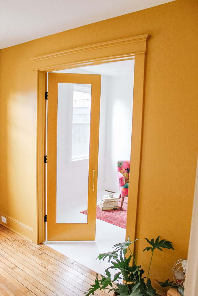
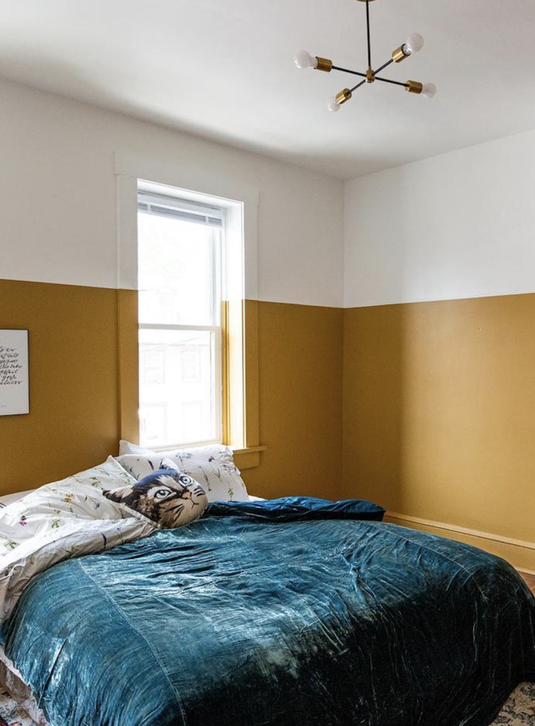
That’s correct, it’s not yellow – it’s Bosc Pear by Sherwin Williams. Of course painting a house with one color always takes some creativity and some tact. And a color as bright as pear is no exception. So most of the house is a simple white, with some black accents and a pop of Pear.
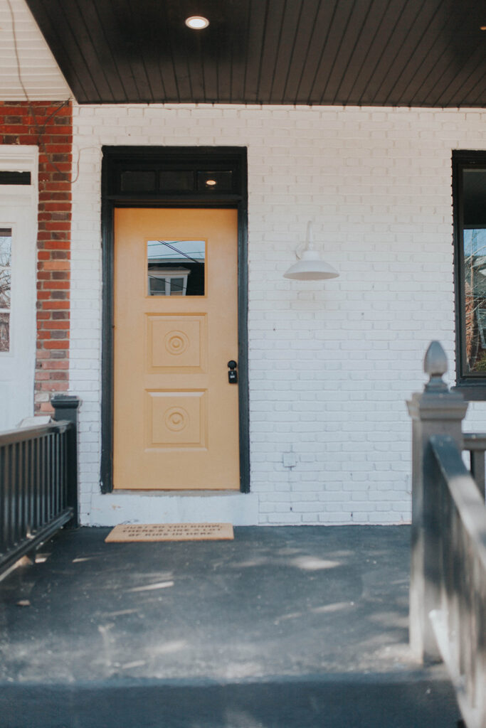
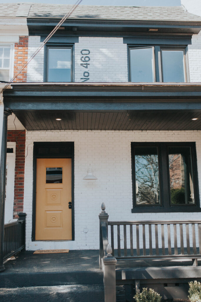
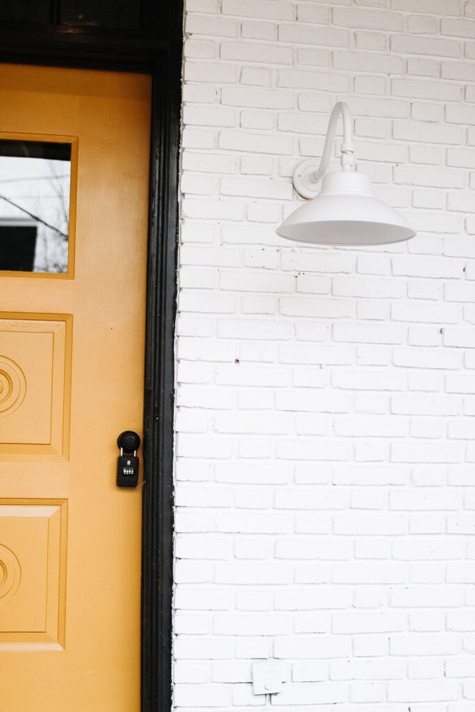
“WE’VE LEARNED HOW MUCH WE LOVE UNEXPECTED THINGS- LIKE YELLOW, UR, PEAR, CABINETS.”
Claude
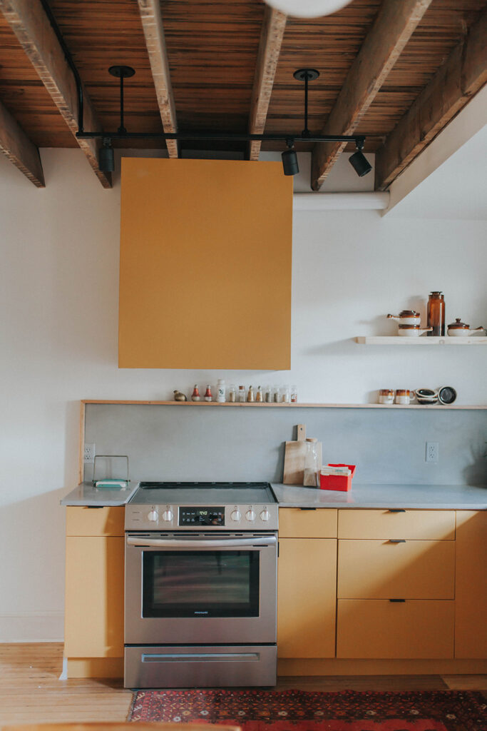
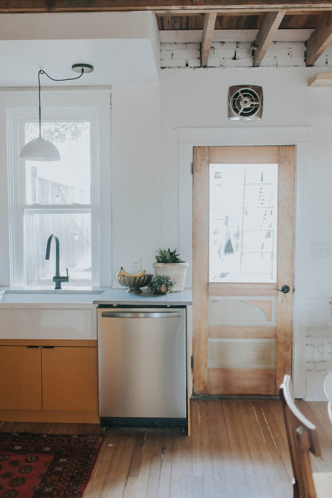
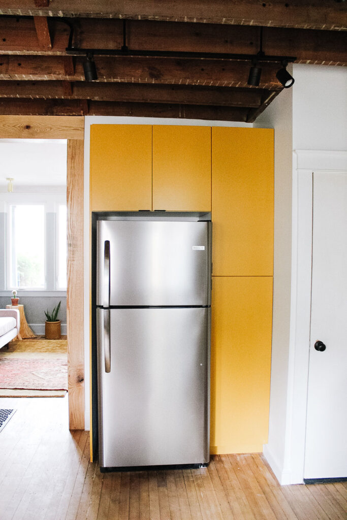
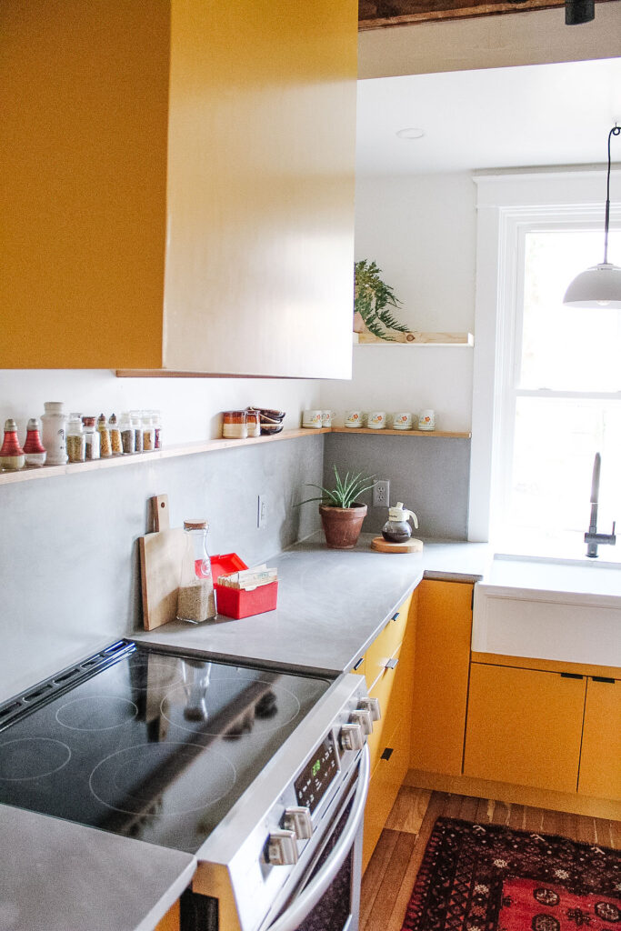
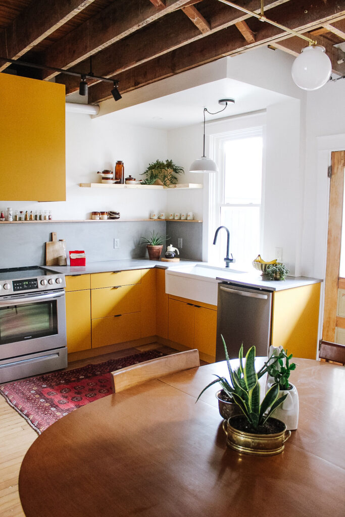
We understand that it’s a bold and unexpected choice, which is why we chose it. We painted the cabinets Pear, we painted two/thirds of the wall Pear, we painted the door Pear, we painted entire walls and trim Pear. But we also complimented the color with white walls and gray paint and wood accents and a cute little bathroom sign. You can check our the entire gallery of the project here. Complete with some of the early lessons we learned in the renovating business.
THE ONE THAT WE WENT WITH A RAINBOW
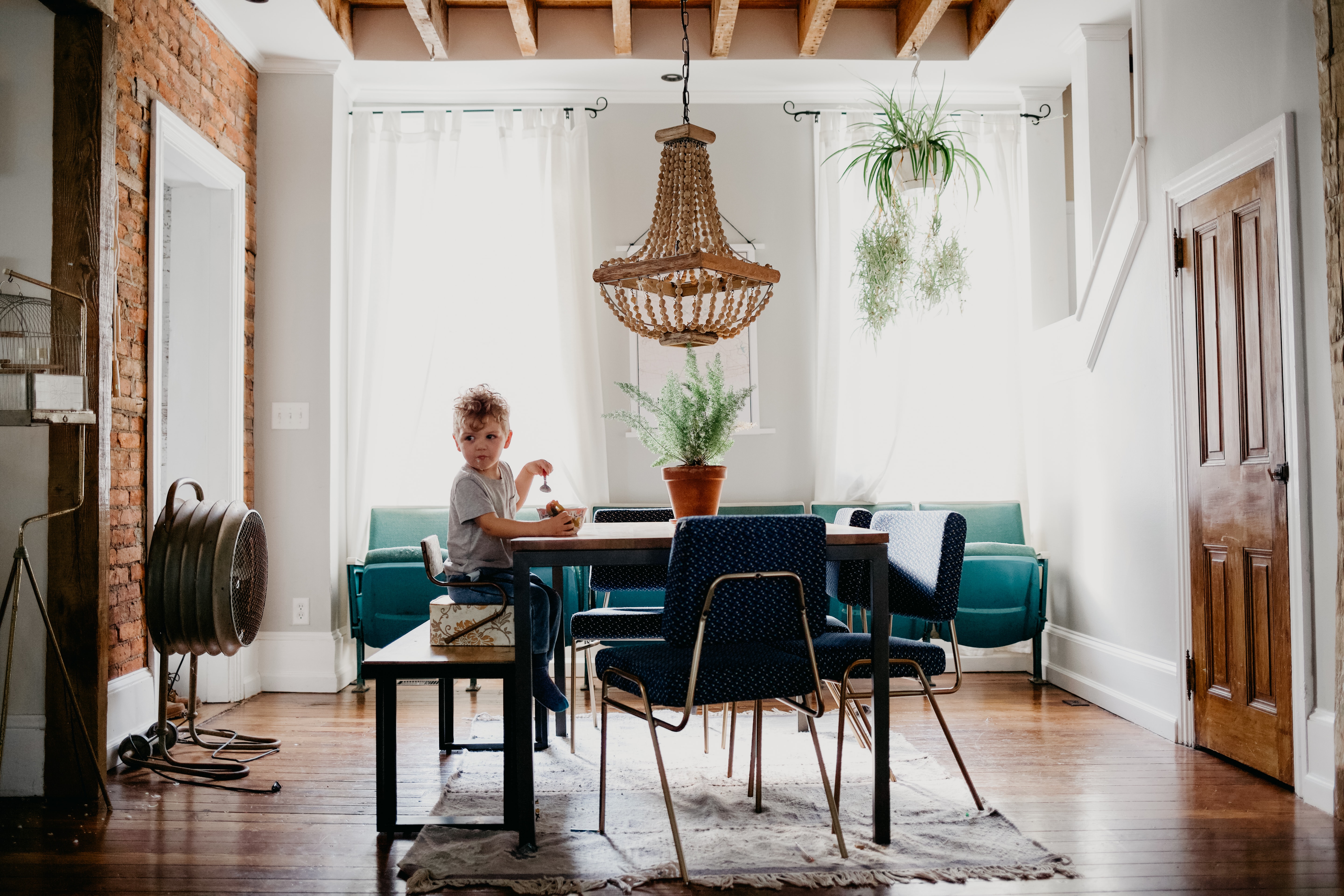
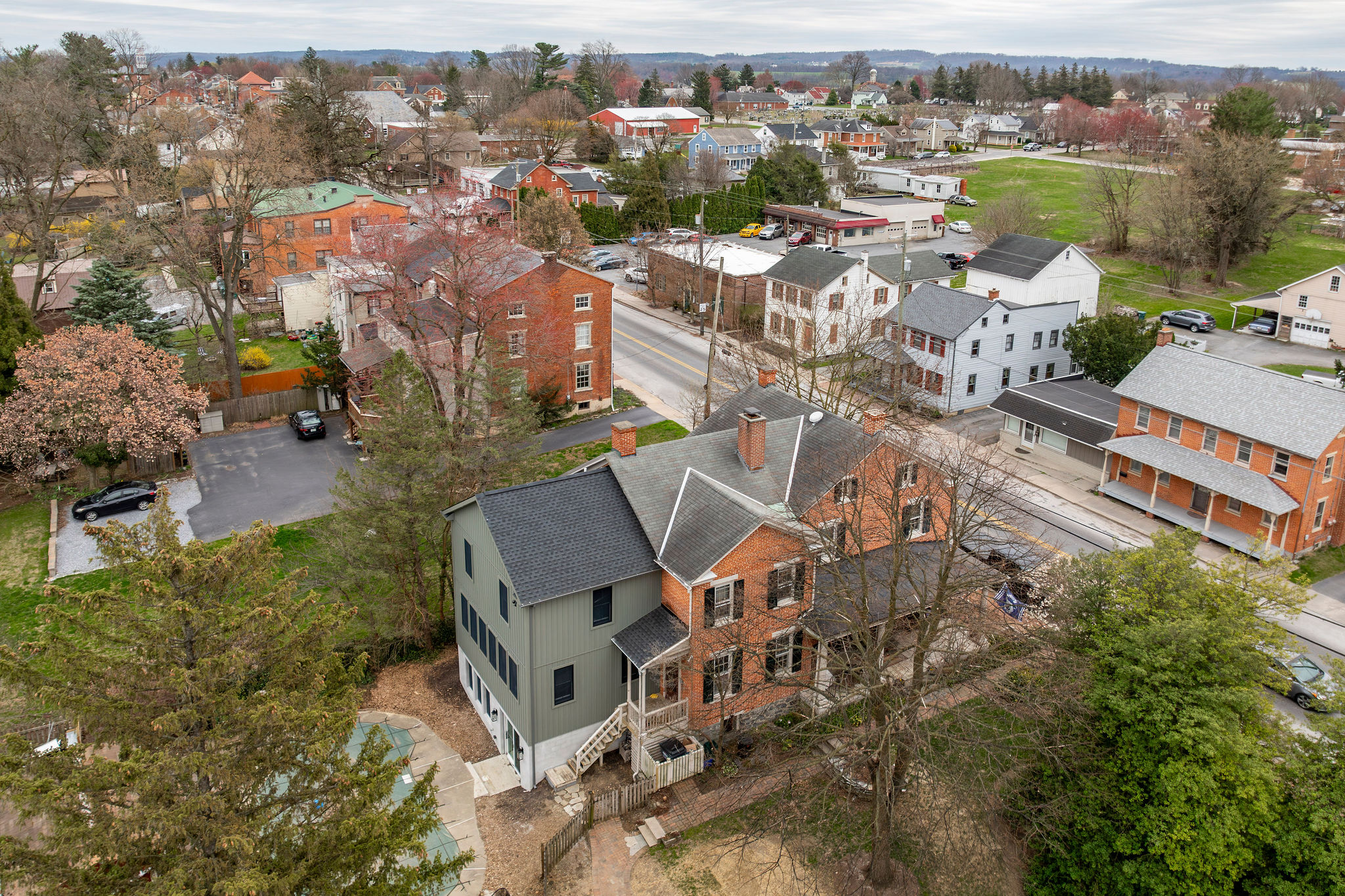
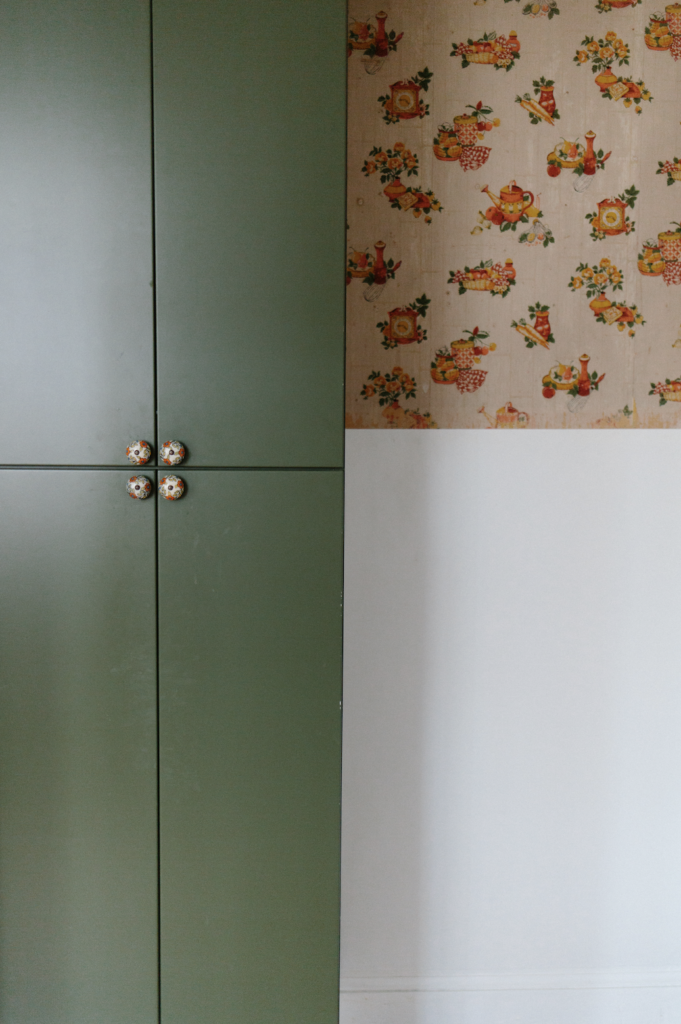
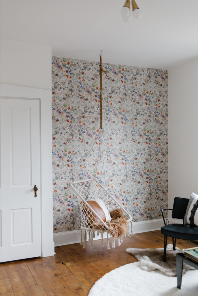
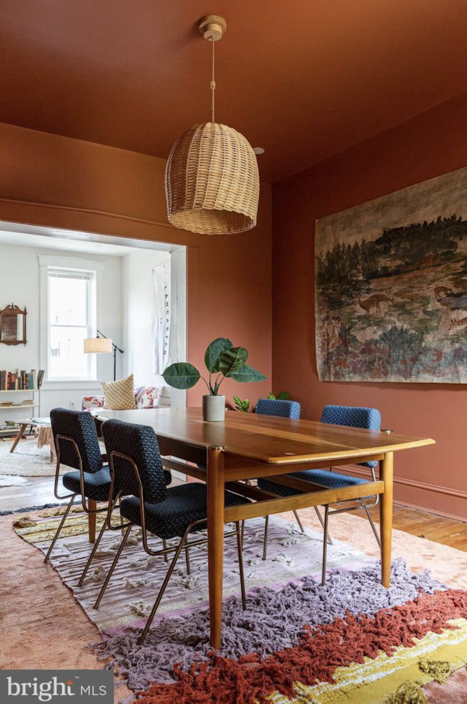
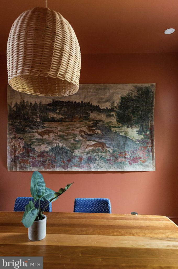
Prince Street is not your average house, but it remains one of the teams favorite renovations. Complete with a green exterior, green kitchen, rainbow stairs, rust dinning room, blue bathroom, and colorful bedrooms. You can read all about the renovation, inspiration and see the before photos on the gallery page here.
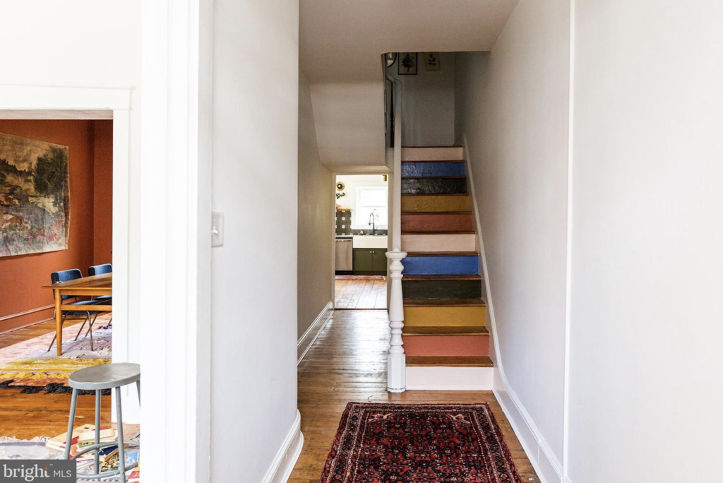
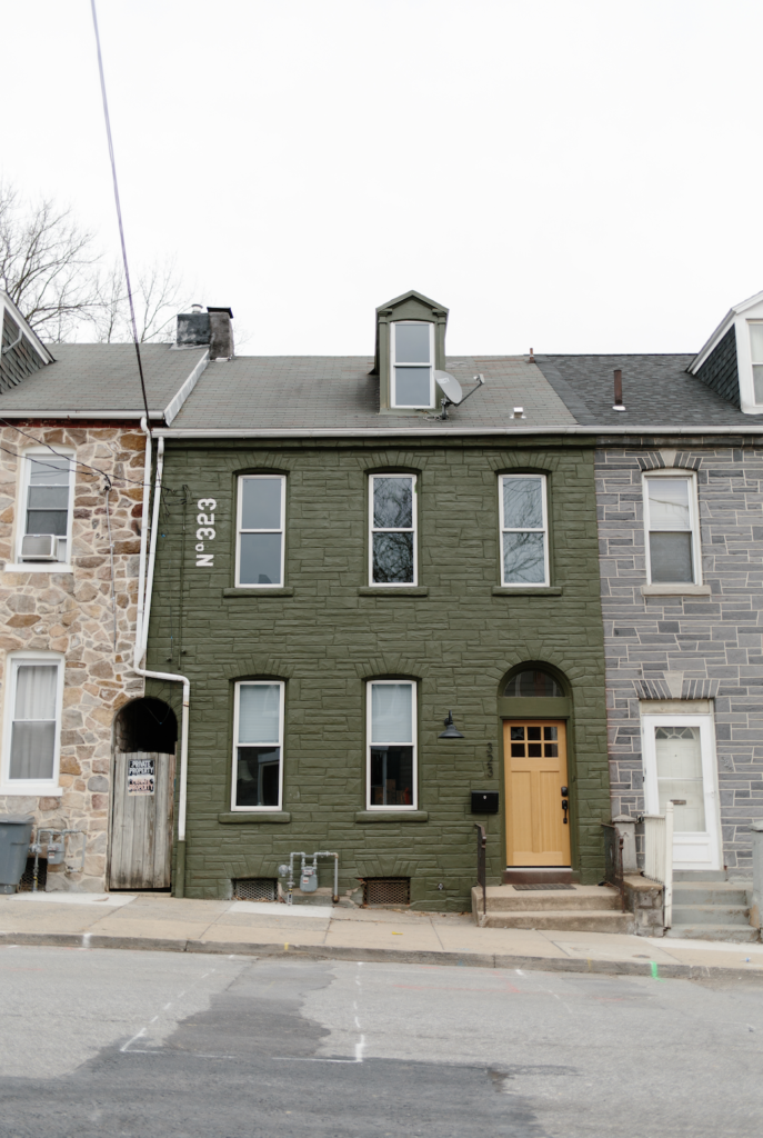
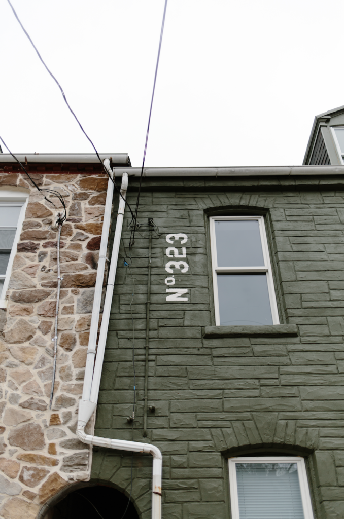
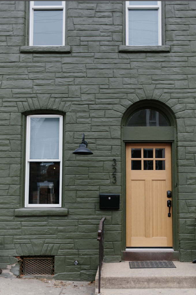
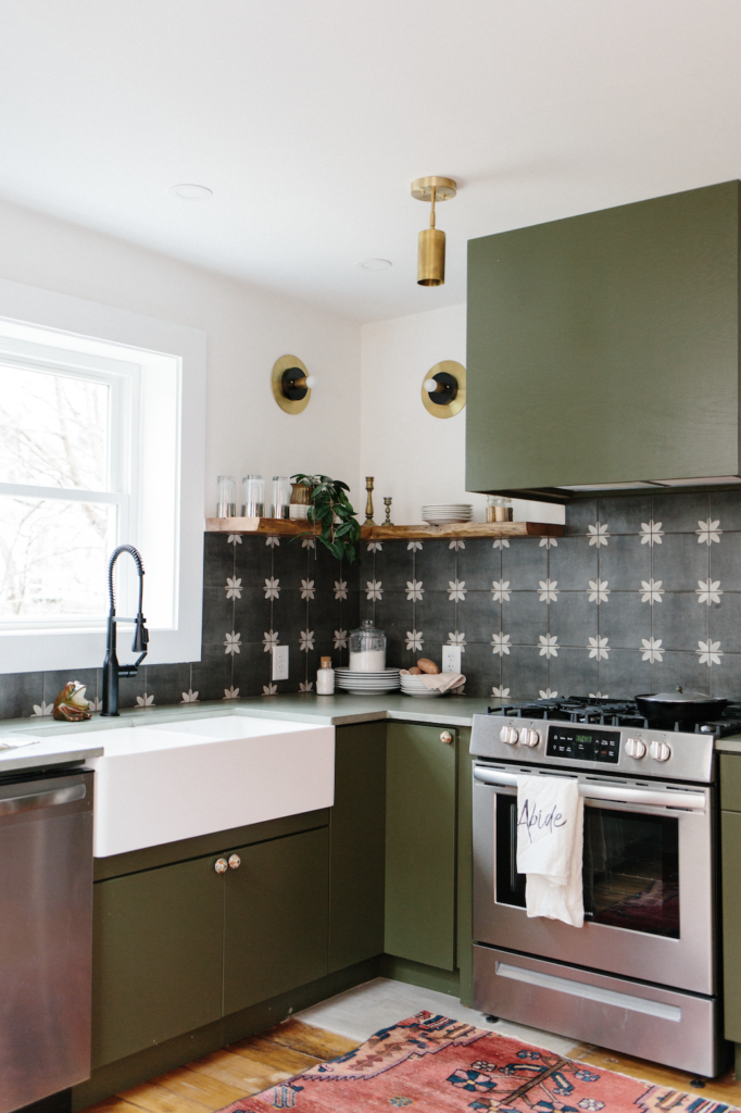
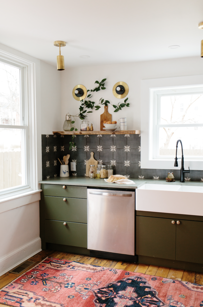
The house had solid bones when we purchased it – though all the while we were very aware that everything needed to be gutted & reinvented.
From the Gallery
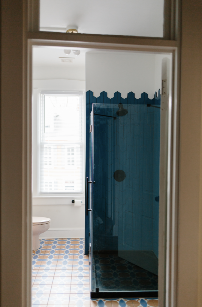
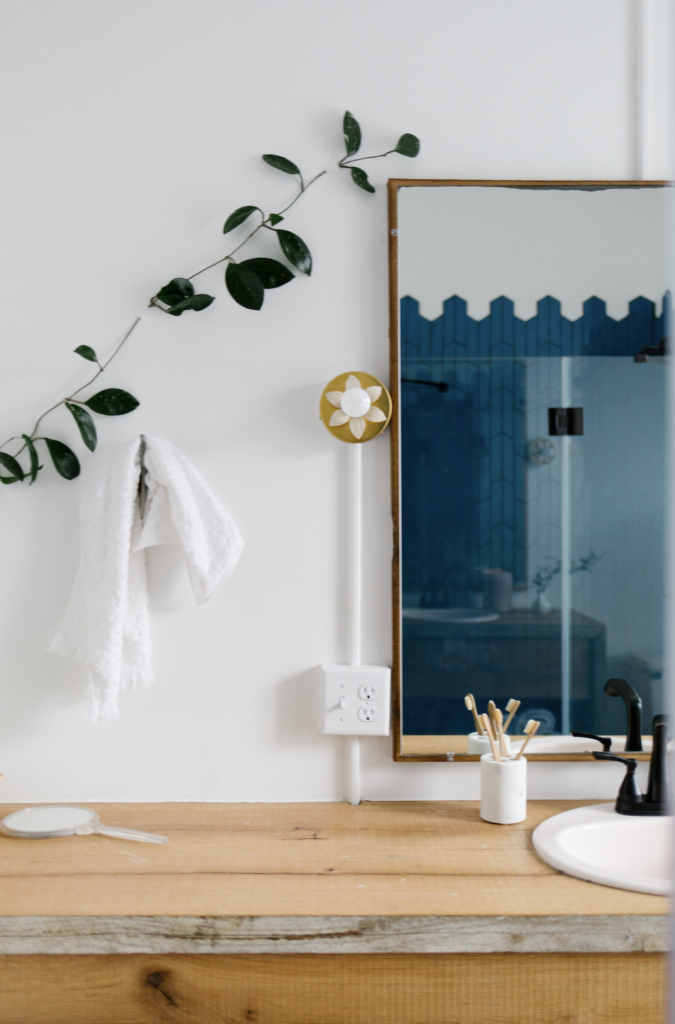
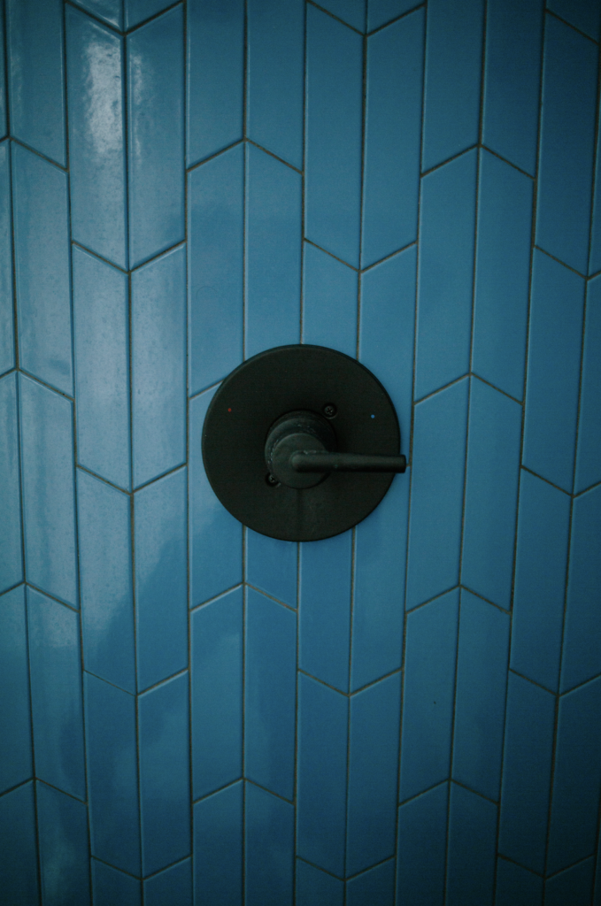
The desire was to design a home that would be life-giving and inspirational. The house when we purchased it was a disaster and needed to be gutted and a complete makeover. (Before photos on the gallery page) I had been saving some color blocking photos for a few years leading up to the project, and many of those photos were the inspiration of the colorful home. And the kitchen really has become one of our most iconic and recognized flips.
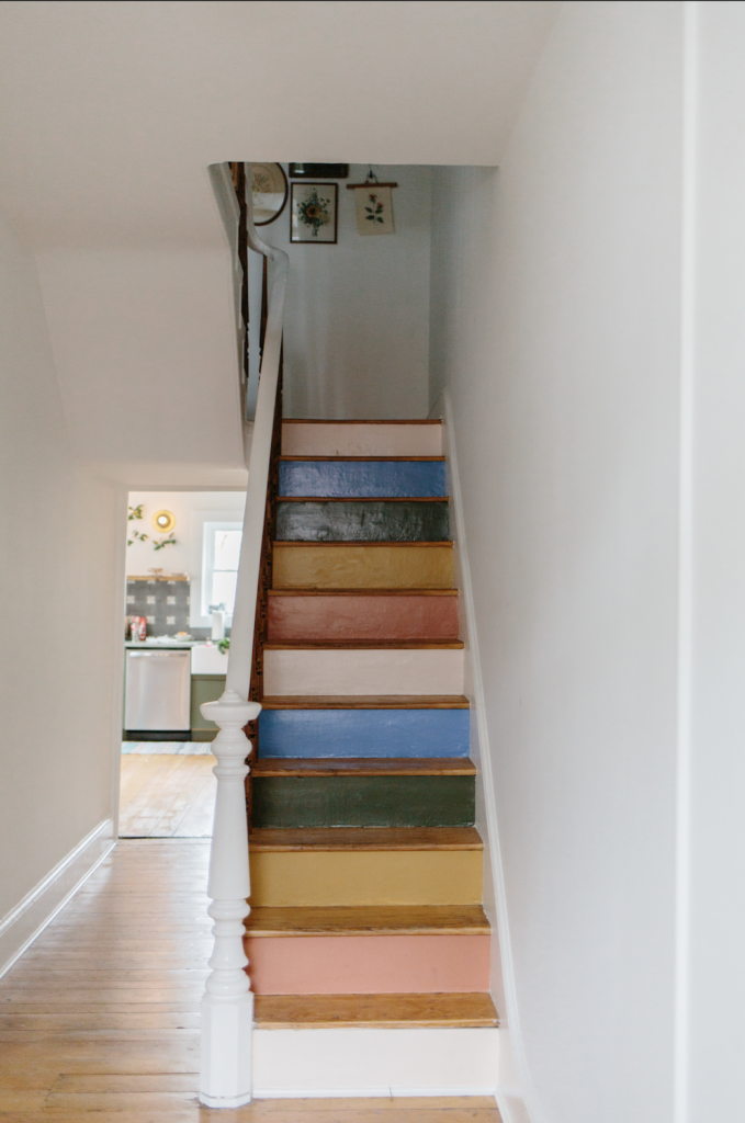
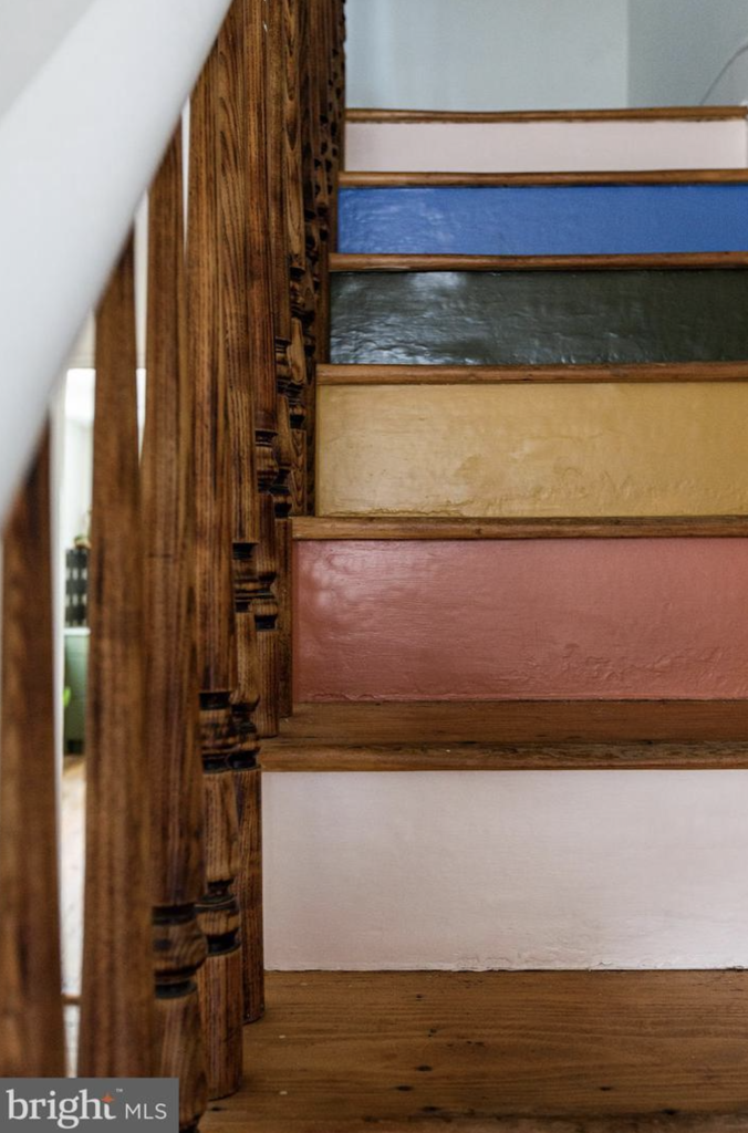
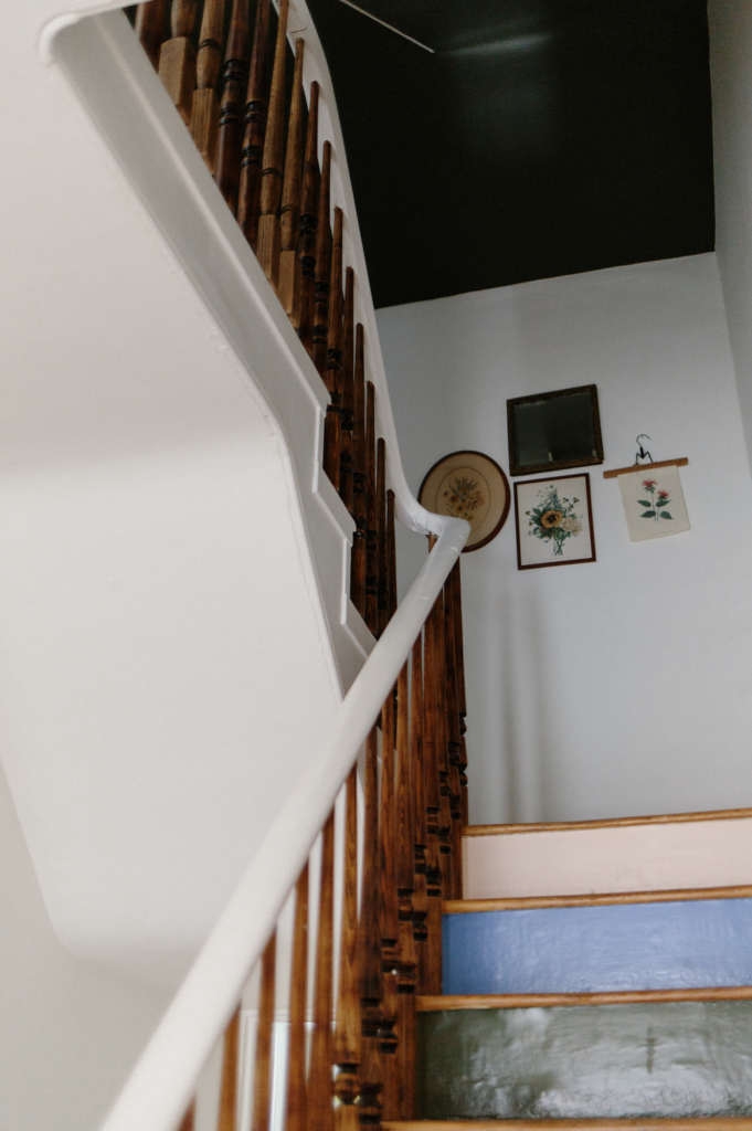
“It’s hard to pin-point the style for Prince Street – The word “colorful” comes to mind. *eh heh* We decided to go bold, inspired by a few color blocking photos I had saved in my archives for the past few years.”
Claude
Conclusion
Through the years we’ve completed a plethora of design styles. From modern simple white houses, to French inspired cottages, to the most colorful brightly inspired houses. We knew that from the beginning we did not want to be a design company that felt as if our designs were copy and paste, and we’ve worked hard to keep our designs unique and catered toward your needs (if you’ve worked with us).
If you haven’t worked with us but you’re interested in what we do as designers you can read more about us as designers here.
Or if you’re like to buy or sell your house, you can also learn more about working with us as your real estate agents.
