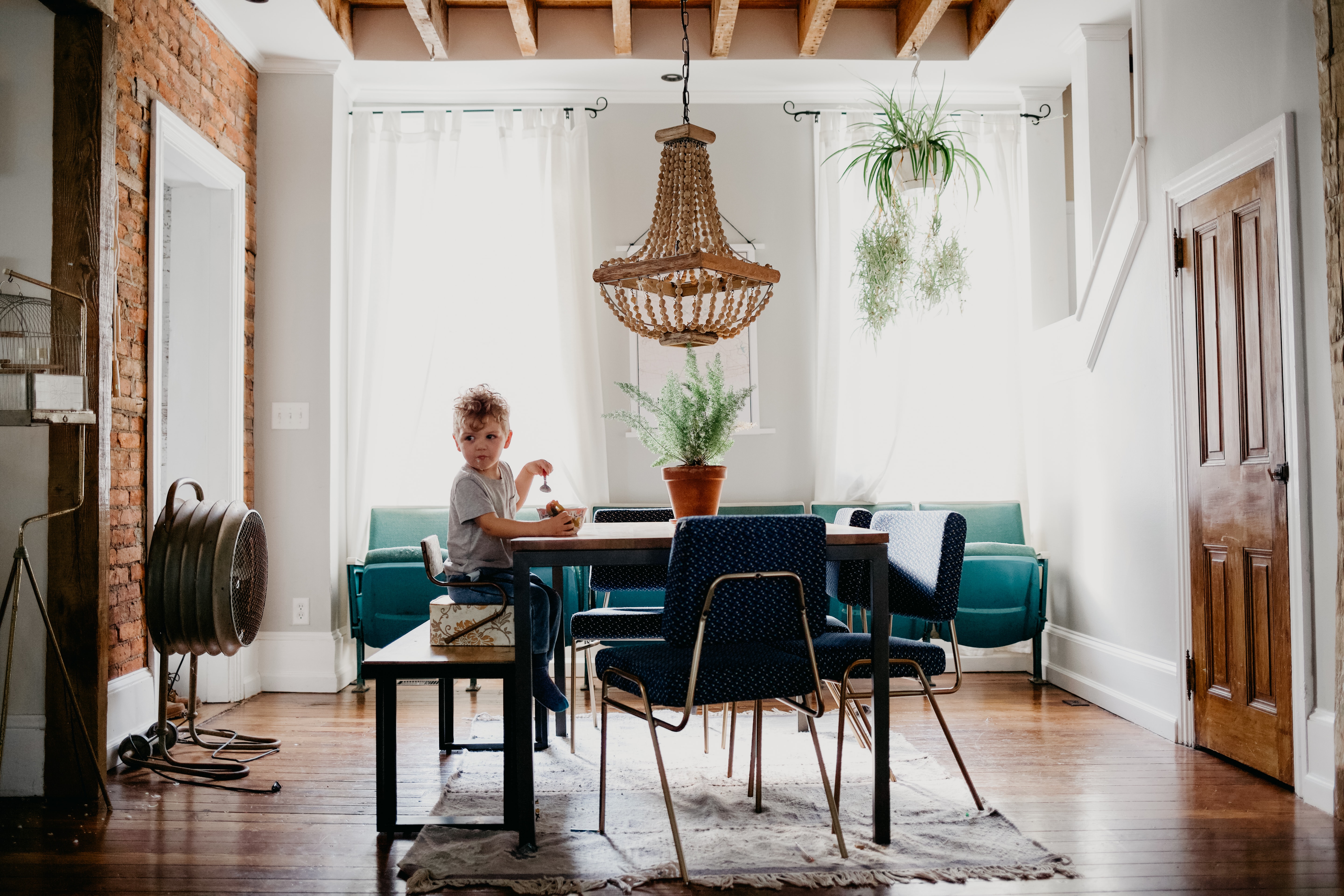

Design is so much more than just a system or series of hoops you jump through to come to the correct end result. Design is art, and art is based on the artist. Home design is always going to look different- based on the situation, the inspiration, the colors on hand & especially the artist.
Now don’t get me wrong, white is classic- and beautiful. But for design to work- it has to come from the designer.
We are fond of painting walls white so that we can easily switch out funky furniture & add pops of color in other ways. I love having the freedom to change out my furniture as needed without having to worry about it clashing with colorful walls. But there is always an exception to the rule, and lately there’ve been a lot of exceptions to that rule.
Meet our first excursion into color- Walnut Street
It was scary at first- not knowing how the idea to incorporate that forest green at Walnut Street would be accepted. But the team went all in. And can I get a raise of hands for how well it turned out?? Let’s just revisit how beautifully those cabinets soaked up all that natural light.
Up next- dear Louise Avenue
She stole our hearts from the very beginning. We were shooting for all the retro vibes and I think we checked all the boxes- thanks in part to a leap of faith and a can of light pink Sherwin Williams paint.
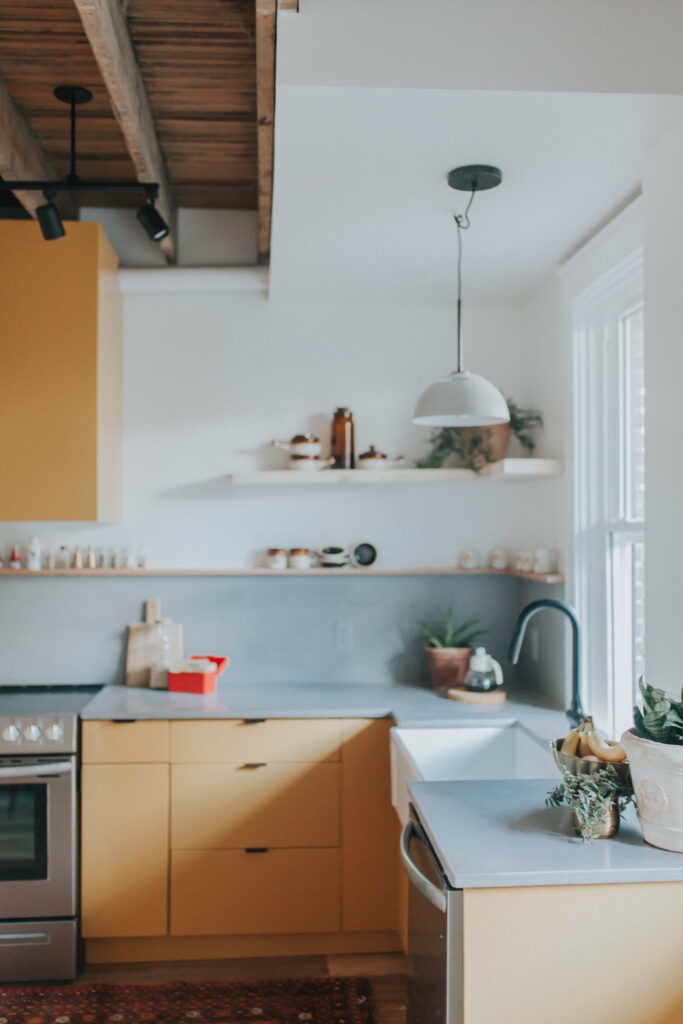
Last but not least- enter New Dorwart street. The list wouldn’t be complete without our most recent conquest of New Dorwart Street and the infamous pear kitchen cabinets. I know we went with the minority for this one, but I must say, the result was striking. So many of you offered some really great feedback. Check out some of our favorite comments from you wonderful inhabitors of the ‘gram.
“Pear is a surprise. The Chris & Claude Co. has a reputation of blasting out of the mold. They rock the element of surprise…and always make it work.”
– Anita Schrock
“Warmth and light. When combined with whites and all the greenery, the effect is amazing. I never would have dared, but it was the right choice. I’m all about warm and sunny right now, so pear has my vote.”
– Rebecca Riehl
We couldn’t agree more, guys. Thanks for the votes of confidence.
If there’s even an ounce of you that loves the above photos- you gotta try it. Don’t lose heart! The worst thing that can happen is that you get tired of it in a week and have to repaint. Even so, you’re only out a few hours of time *hopefully*
If you’re scared of the risk, furniture is another amazing asset for incorporating color. Just about every major store now debuts colorful home decor- so try your hand at mixing and matching! One of the cheapest & instantly fun ways to add a colorful pop into your home is to add a rug. Our favorite source is rugsusa.com– they often run massive sales & you can snag a beautiful patterned rug for a dime (I mean, a little more probably- but just think of the end result).
I often get asked if I have any regrets choosing to incorporate color into our homes. To be honest, there were no regrets with Louise Ave. None. Nada. I love the soft pink and how easy it is on the eyes. It tells the 1950’s story of the home while merging 2019 into it oh-so-well.
New Dorwart Street on the other hand was a super leap of pear faith. When I walk into New Dorwart, it doesn’t feel prissy, pink or light-hearted. The dark gray lime wash merged with the moody pear color lends itself to a different feel- a more European, retro, moody vibe. I like it. I like it a lot. It’s just different than Louise, or Walnut, or anything we’ve done before.
The team, however still staunchly believes in baby blue cabinets- don’t give them the microphone. Just don’t.
In conclusion, the thought I want to leave with you is that there is value in taking risks. Don’t be afraid to go with that bold paint color. Don’t shrink back from choosing a brightly colored couch or patterned rug. It will always pay off (I mean, don’t quote me on that, but I really think so.)
Color reminds us to smile and to take life a little less seriously. Color rocks.
much love,
Claude + Chris + Team
credits:
Photography creds go to: Shanna Midgley & Kinna Shaffer
We get all of our paint at Lowe’s in Sherwin Williams, even if it’s a Benjamin Moore color, they color match and it’s way cheaper than finding it at a specialty paint store.
White: Chantilly Lace / Benjamin Moore – this is a beautiful pure white with no yellow undertones! We discovered Chantilly Lace a few houses ago & haven’t used any other white since.
Gray: Repose Gray / Sherwin Williams – We used this gray in our personal home to add warm tones in our living room & dining room. We worked long & hard to find the perfect gray & had lots of mess-ups & nasty gray turned blue before we stumbled across this gray color. No blue/purple or green undertones here folks! Just pure gray.
All time favorite color: Forest Green / Benjamin Moore – I often think this color would be so pretty painted flat on some walls!
some of our favorite champions of color:
Chris Loves Julia – newest bedroom reno…such a beaut
Domino – fave kitchen colors
Emily Henderson – just take a look at that oh-so-colorful feed
Anthropologie – forever and always an inspiration