
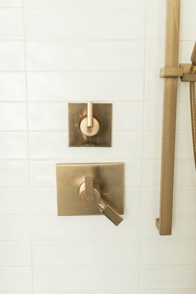
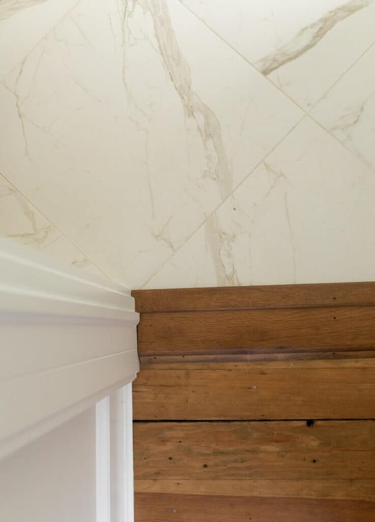
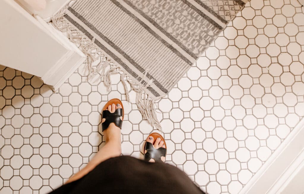
If you know about any of our designs you know that we love exposed beams, hardwood floors and wallpaper. We like to pick statement colors and create spaces that you help you thrive. But you may not know that we carefully pick out each tile design that we use in our projects. Sometimes we chose a simple square tile or penny tile. But more often we choose something that will stand out and compliment the room we design.
Louise Avenue
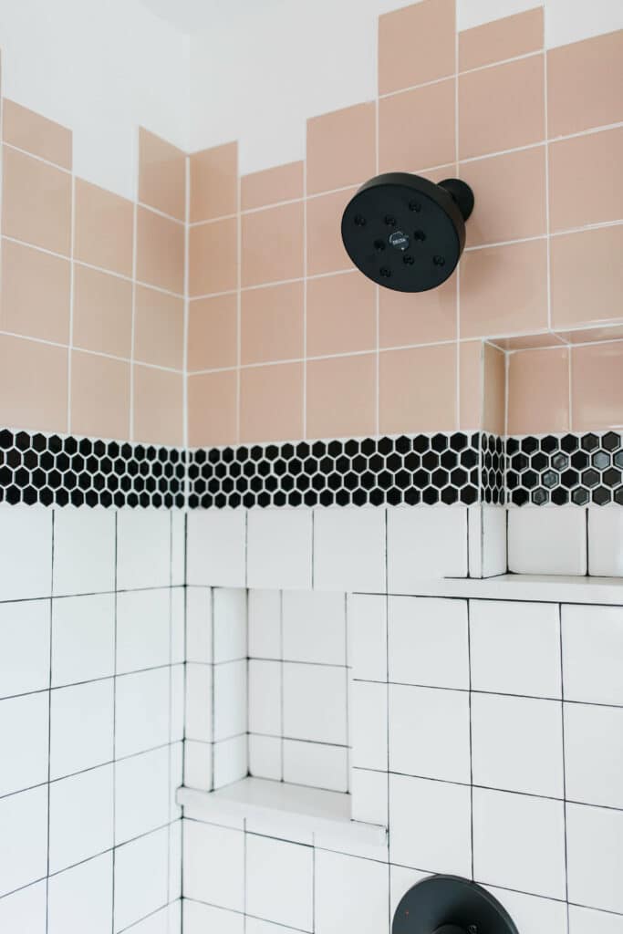
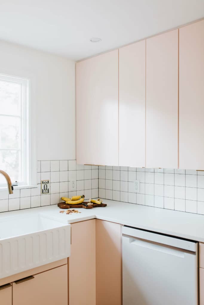
The project with “modern 50’s with clean lines and lot’s of pink” started out as the project with dark walls and very little light. But we were excited to renovate and flip the house. We wanted to make sure that the light pink we had used throughout the house would be in the bathroom as well – and we found the perfect solution in the light pink square tile from Habitat for Humanity. We enjoyed designing the shower with the white squares that matched the floor, but added a fun colored tile to the top with the tile ending in a design to make it look more unique.
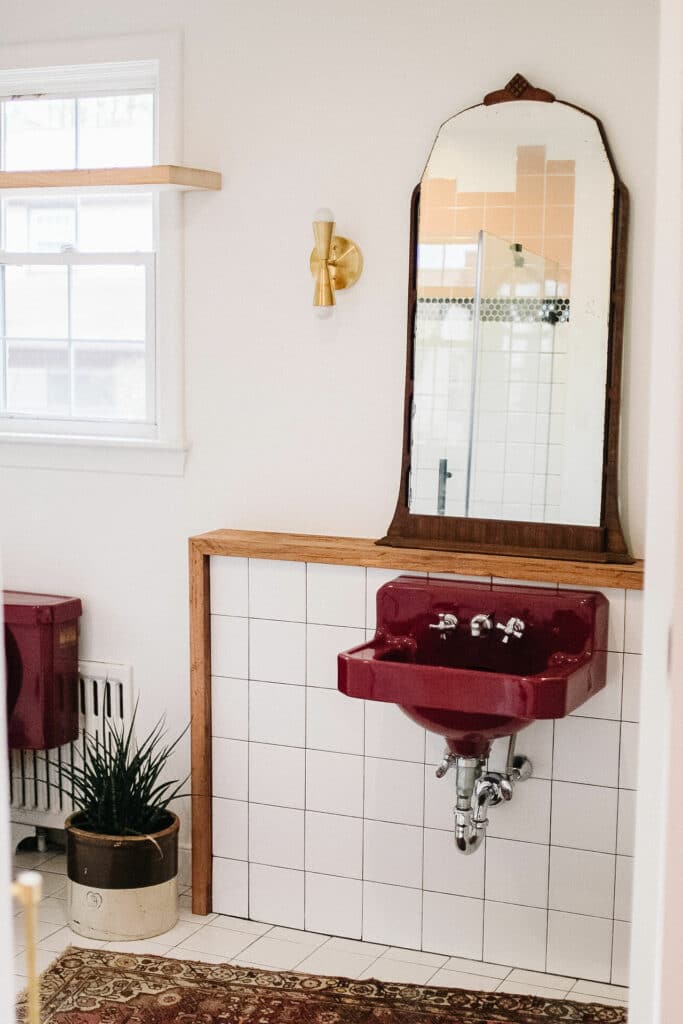
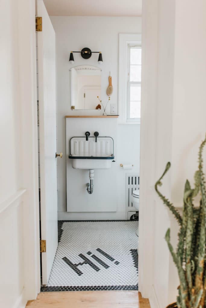
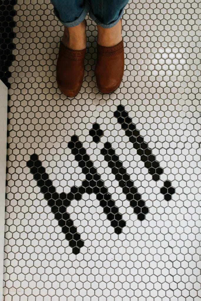
And of course our easily recognized penny tile that says “HI!” on the floor was the great way to give a unique flare to the half bath. The black and white tile complimented the old farmhouse sink, but it also kept the bathroom from looking and feeling boring.
Columbia Avenue
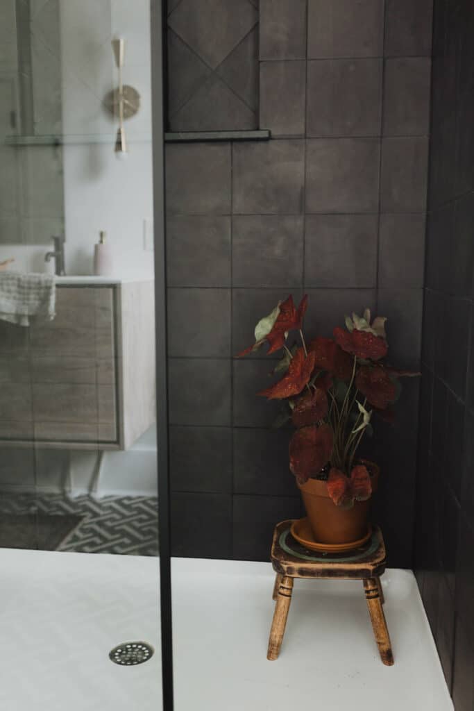
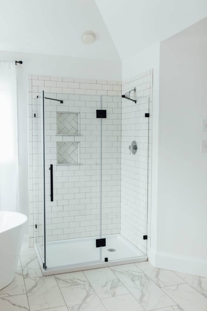
A minimalist design, the Columbia Avenue exterior was painted a gorgeous deep Polo Blue, with the interior mostly remaining white and simple. But when it came to the bathroom we knew that we wanted something to make a statement – and that’s when we chose a dark gray large square tile to complete the bathroom. We extended the tile higher and wider than the shower door, leaving the bathroom with the shower that stands out.
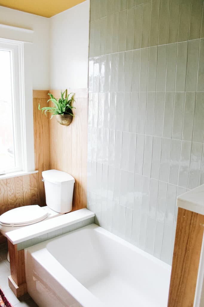
New Dorwart Street
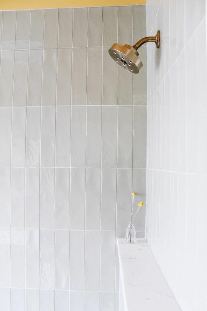
Peak the pear colored ceiling in this bathroom. The New Dorwart Street was a fun project as we painted ceilings, walls, doors, cabinets and more the bright pear color. But we knew that the tile in the bathroom would need to be something relatively neutral, but we wanted it to more than just the generic style that we often see in bathrooms. When we found this long gray rectangle tile we knew we had the perfect look for the small bathroom!
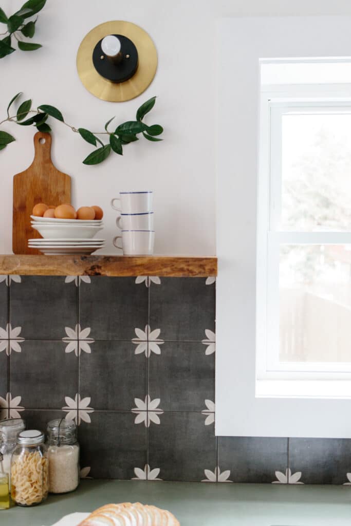
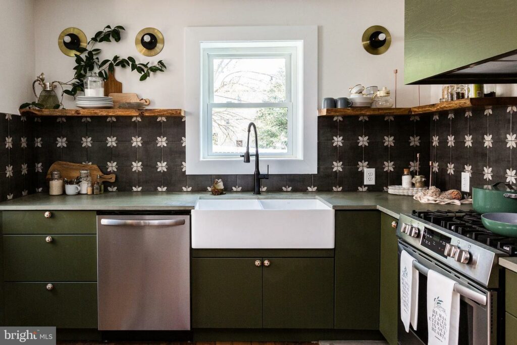
Prince Street
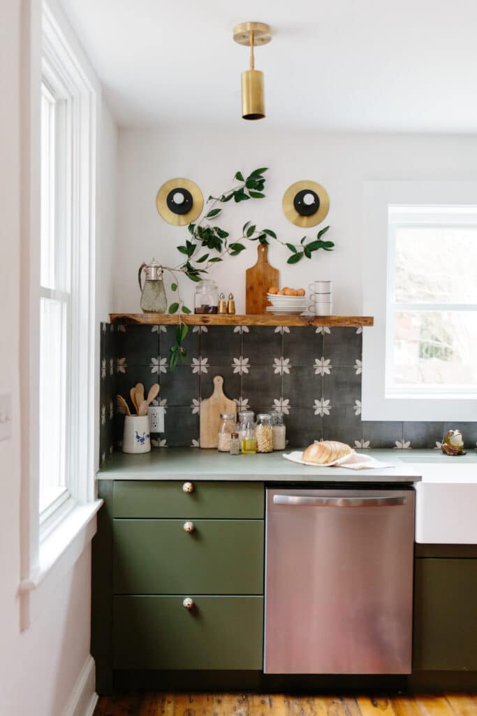
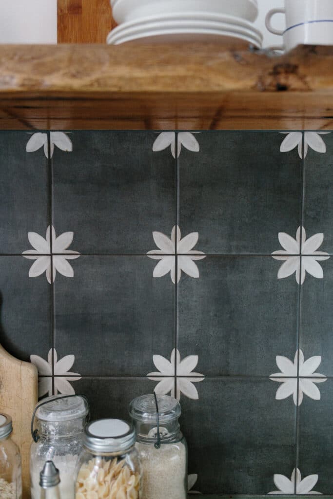
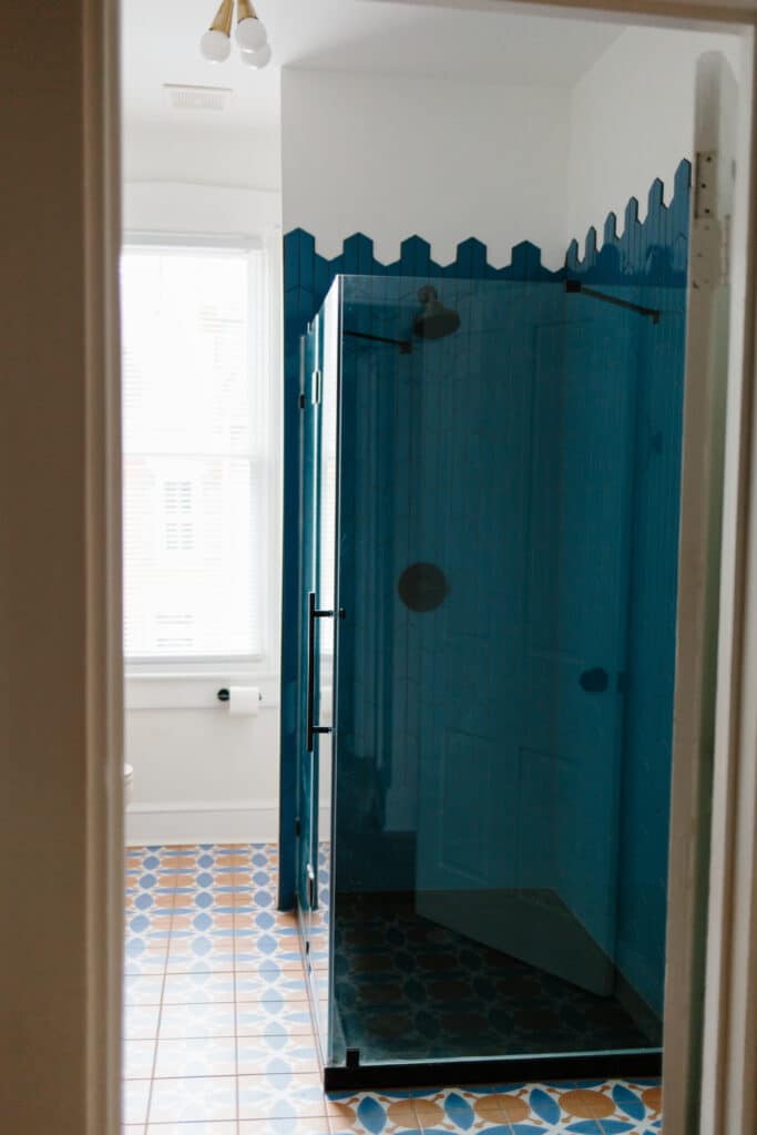
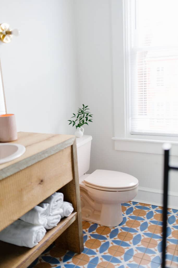
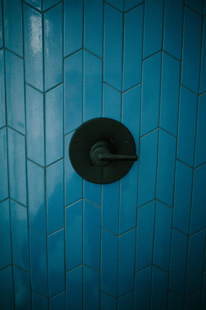
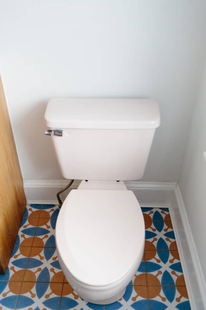
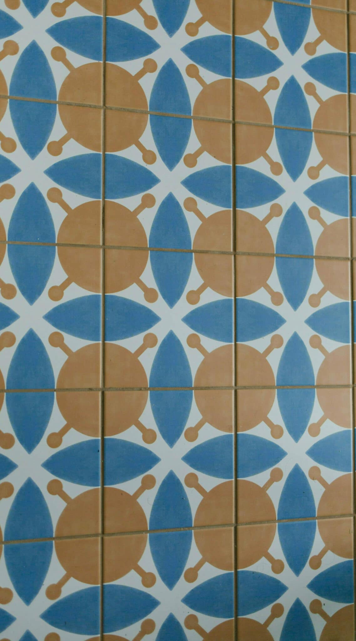
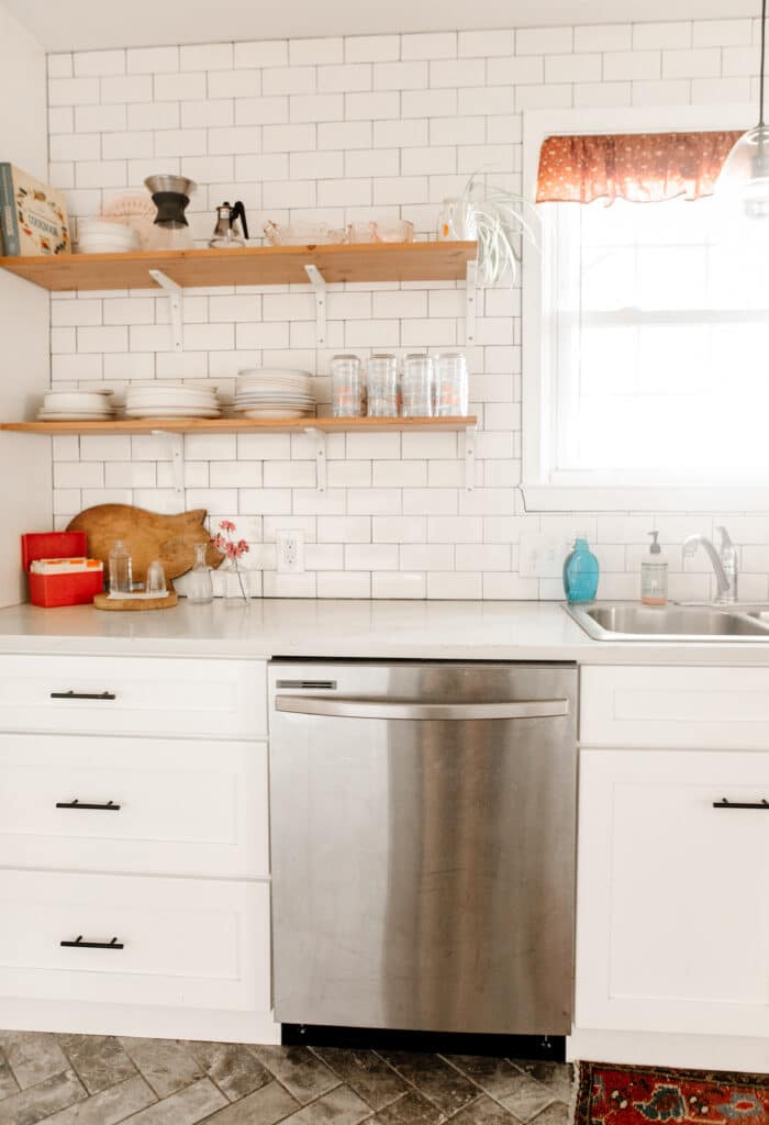
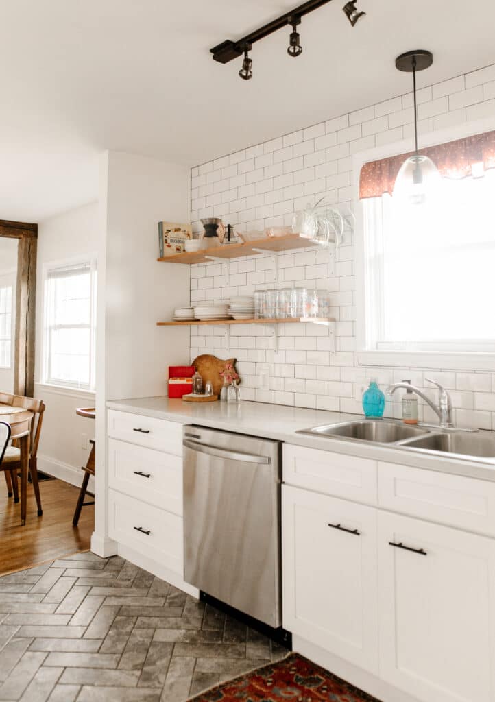
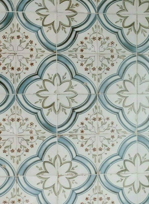
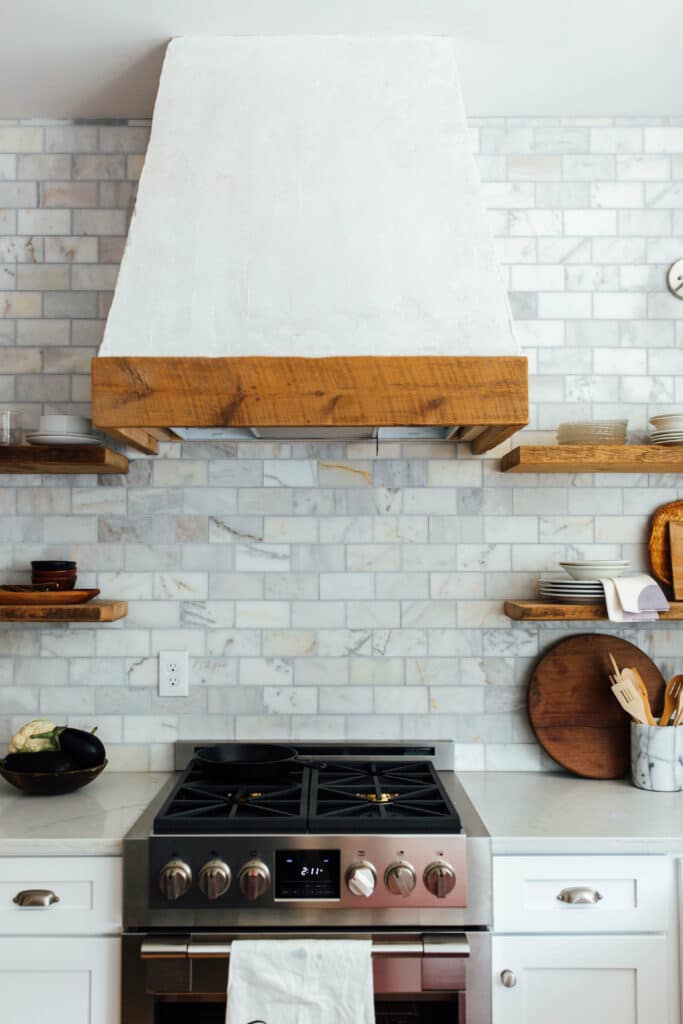
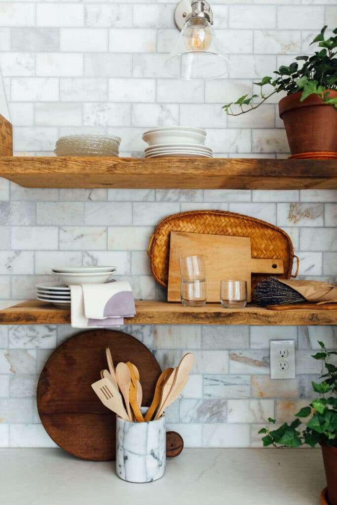
Possibly one of our favorite kitchens ever – the Prince Street kitchen is most recognized for the deep green that we painted the cabinets, but we think that the dark gray tile with the simple design is what makes the cabinets stand out. We left the top half of the walls painted white, and installed a wooden shelf to complete the look.
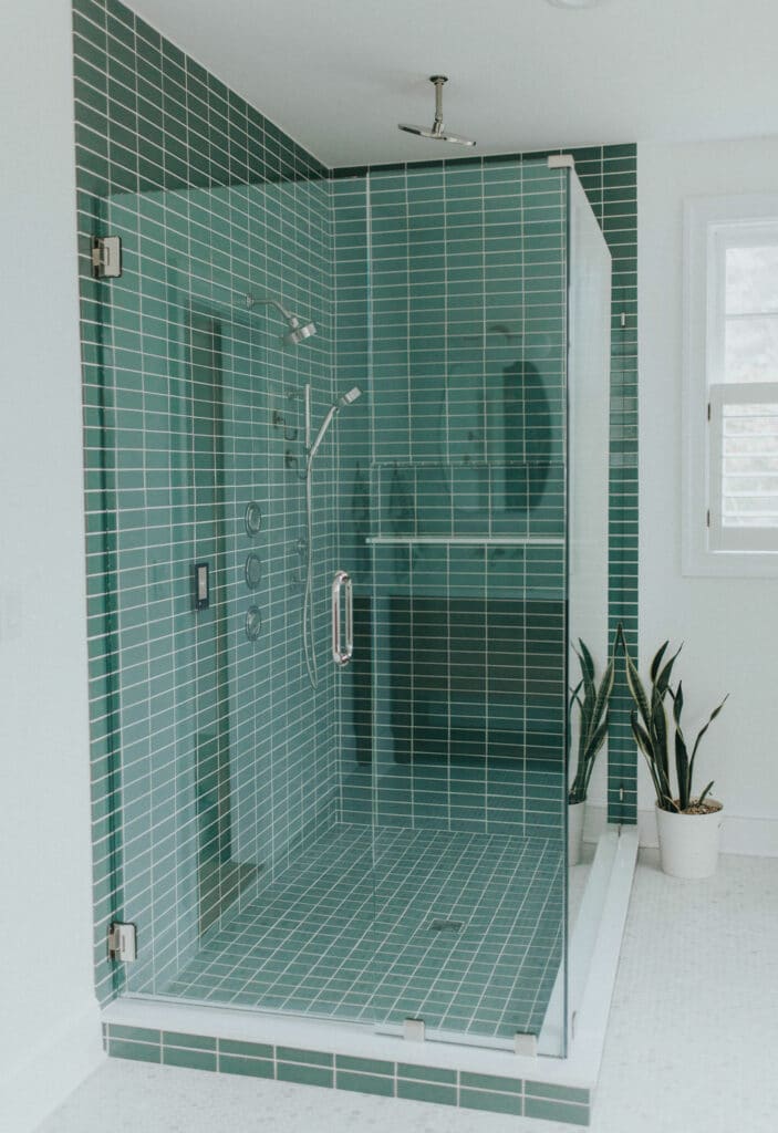
But the green kitchen wasn’t the only room to make a statement in this house. We chose a deep blue tile with a unique pattern for the shower, complete with the glass door and black fixtures. But what really brought the room together was the floor tile with the matching blue and gold design: allowing a small room to make a big statement.
The Patrick Project
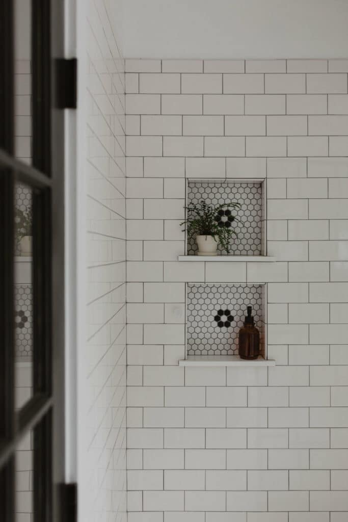
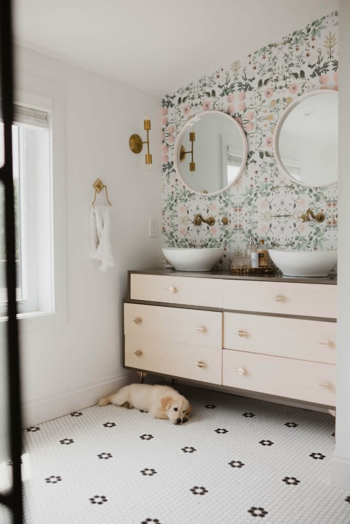
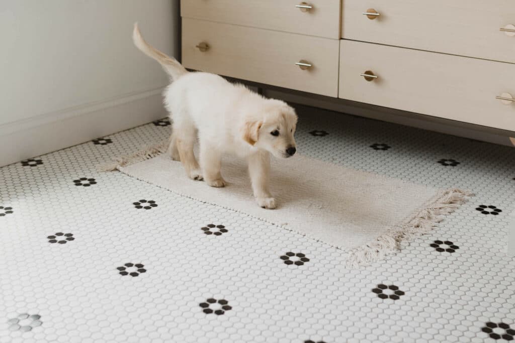
Designing this project for Jeremie and Hailey was more fun then we could have imagined. In the bathroom we chose a simple penny tile with these simple flower designs to give it a little something extra. To allow the wallpaper to stand out we picked a small rectangle white tile for the shower, adding a little flower in the design behind the shelves to pull the floor design into the shower.
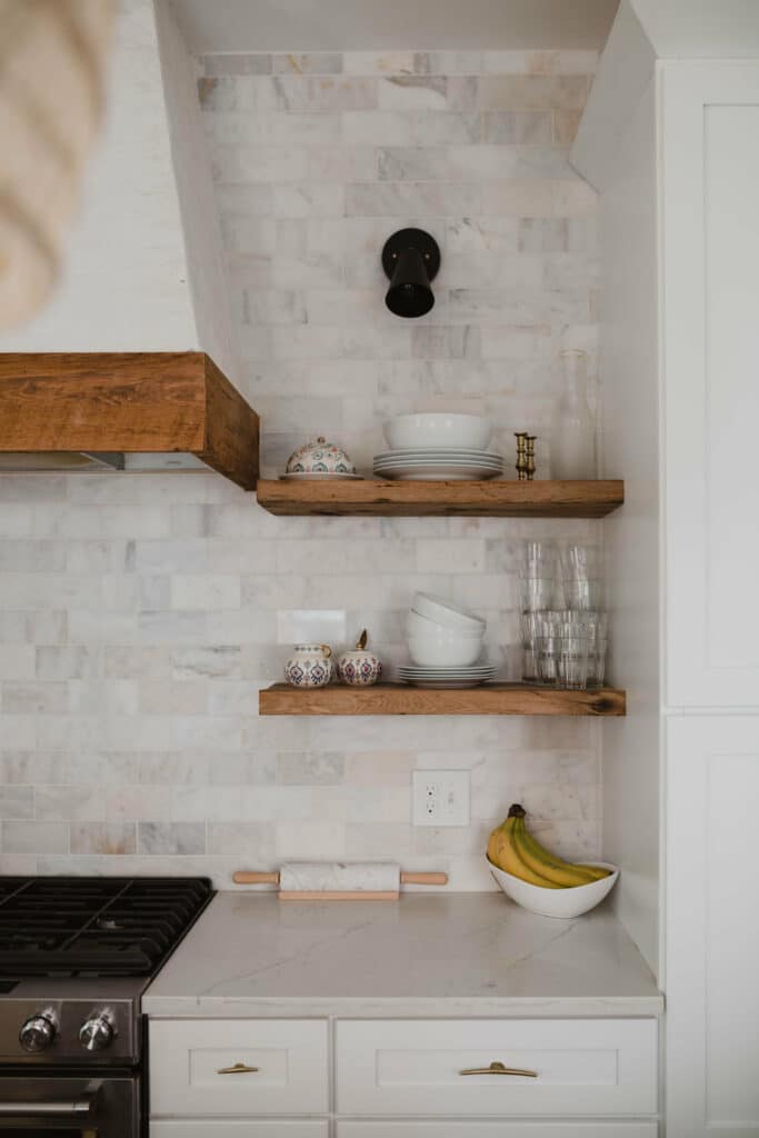
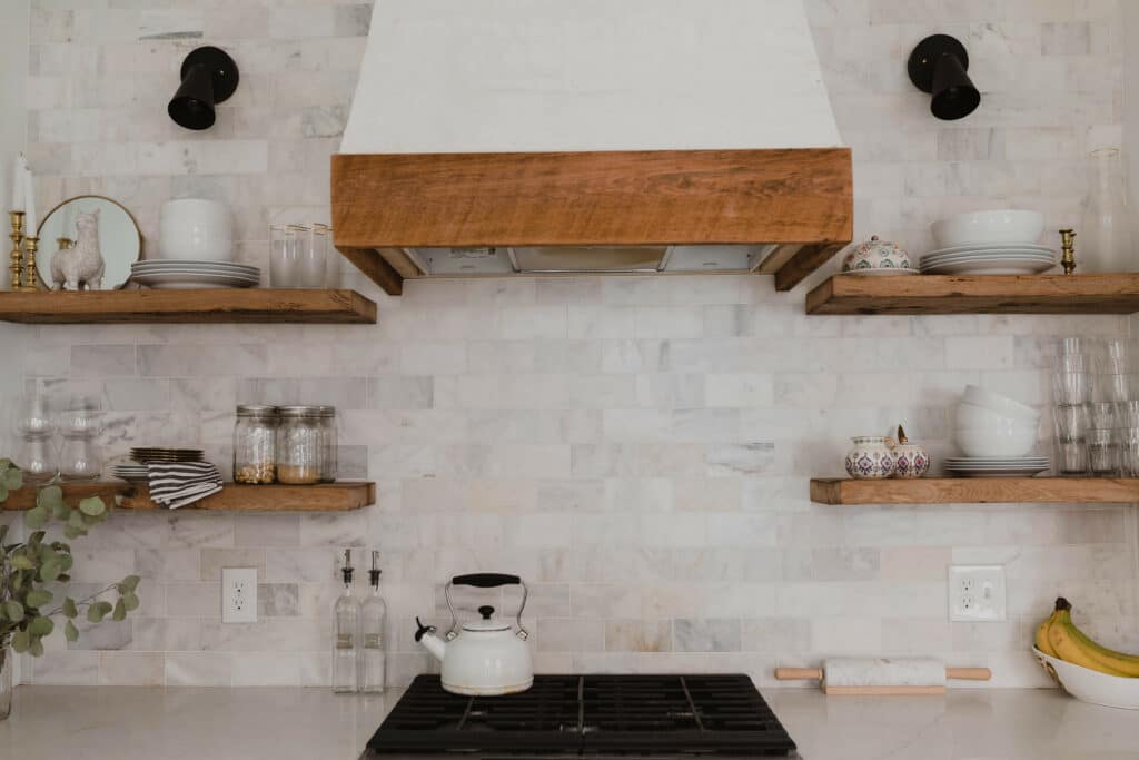
In the kitchen we wanted to give it an industrial look with the black fixtures and open cabinets – to finish the look we chose a rectangle tile with a marble look. The results was exactly what we wanted, and when you complete it with an adorable puppy you know it’s the perfect finish.
The Horst Project
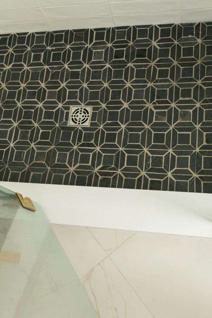
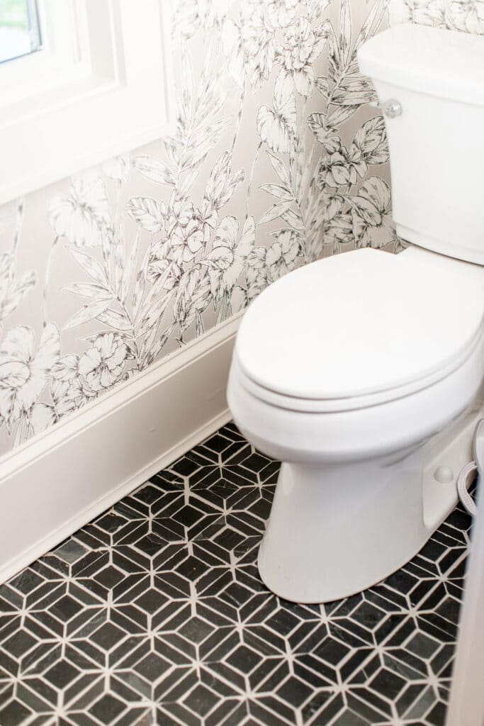
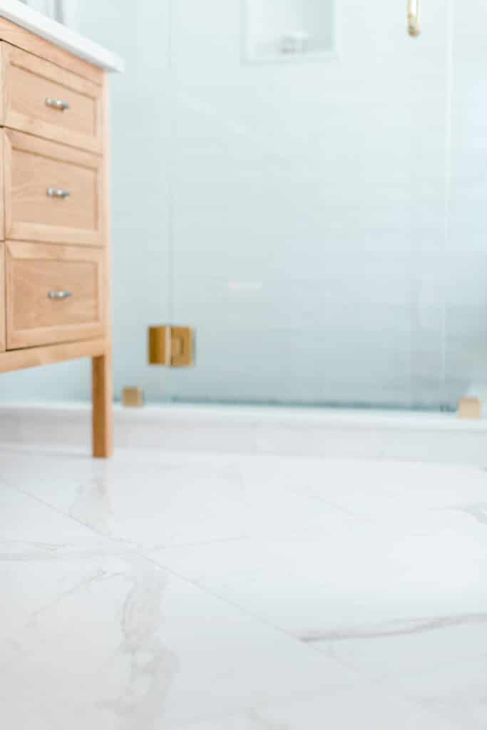
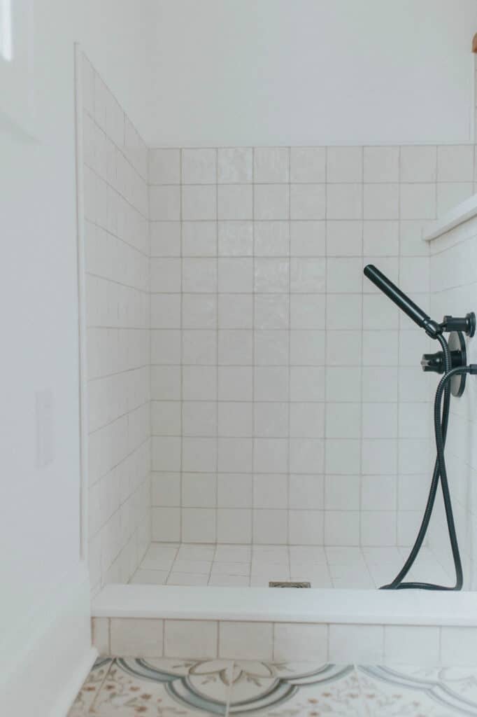
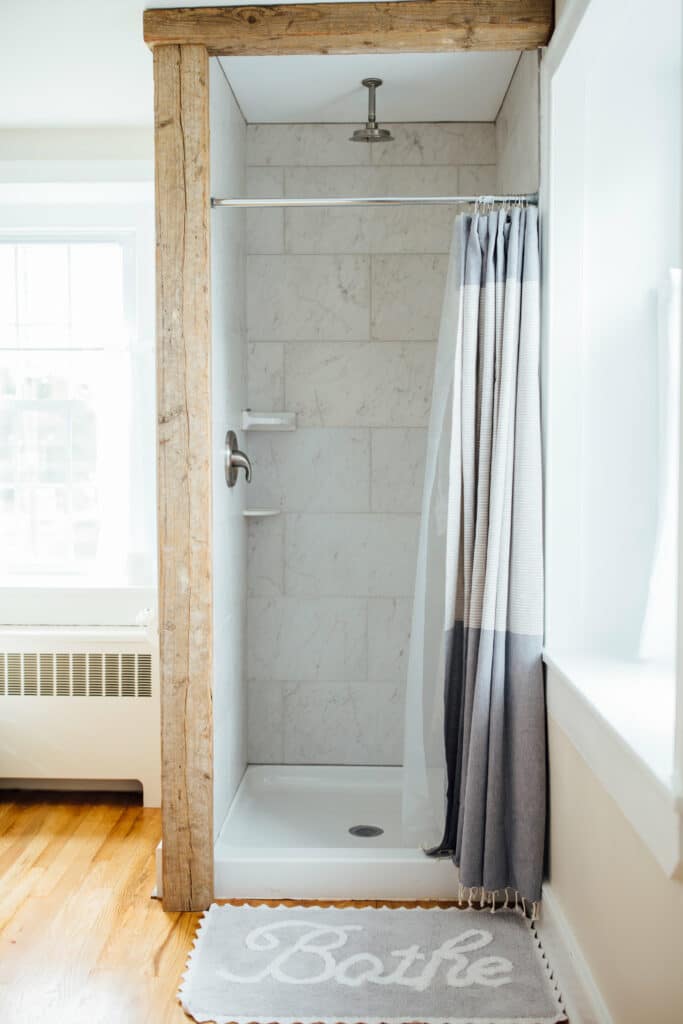
The Horst project was a great mix of simple rectangle tile in the shower to a gorgeous marble tile on the floor and a more intricate black tile design in the shower and the half bath. Each tile unique and specifically chosen for the space it filled. The imperfections of the shower and half bath floor tile really give it a raw and authentic feel.
Our “Ode to the 70’s” Airbnb
For our own house that we designed for an Airbnb, we chose a lot of crazy unique furniture pieces from thrift stores paying tribute to the 70s with their colorful patterned designs. With that we knew that we needed to keep the tile relatively neutral. So in the kitchen we chose a gray tile for the floor and a white tile for the kitchen wall. For the bathroom we found a hexagon tile with the little diamonds in-between the perfect fit for this house.
The Feakins Project
For the Faking Project we knew that we wanted something bold to make a statement. In the mudroom we painted the cabinets orange and used a small white square tile for the wash area and a large designed tile for the floor. After all how could we pass up on the beautiful blue design with small flowers?
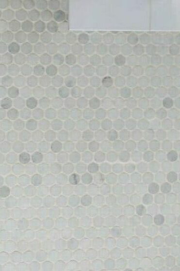
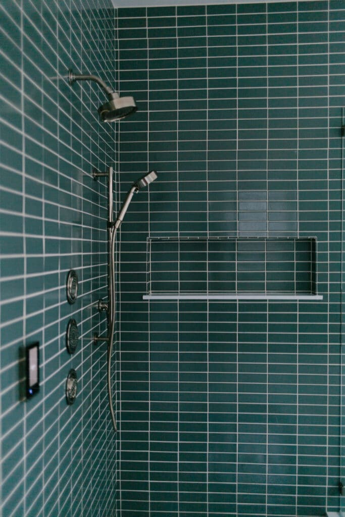
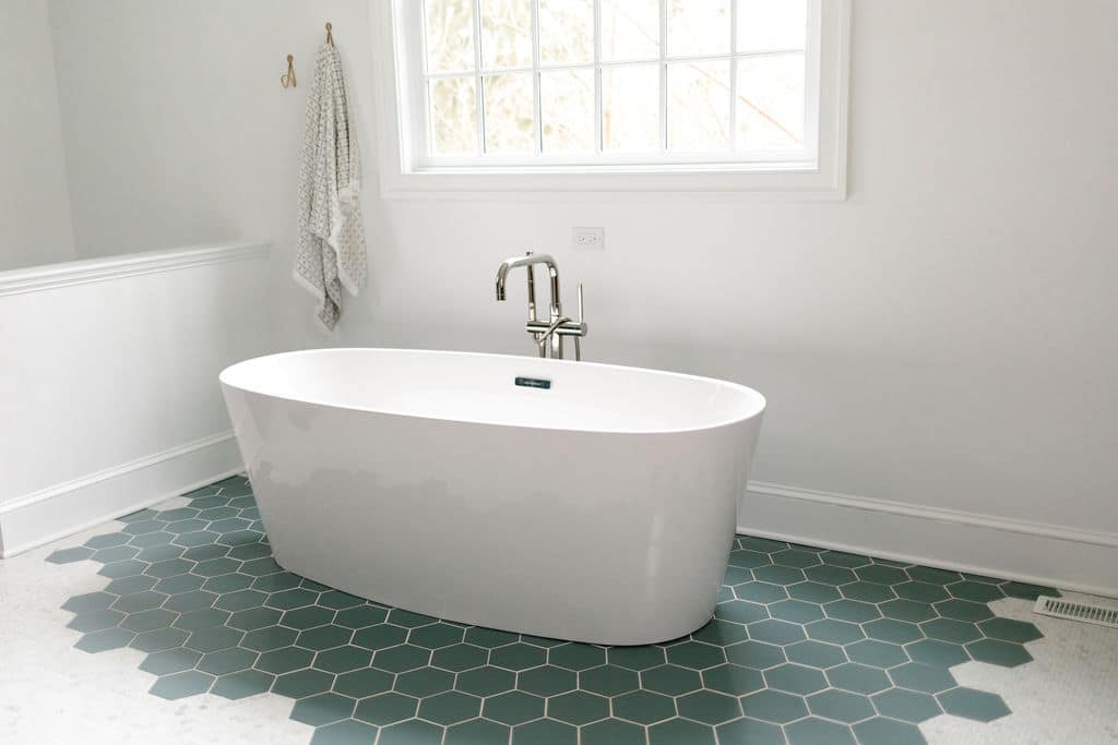
In one of the bathrooms we chose a small dark blue rectangle tile for the large shower complimented by silver fixtures. For the floor we chose a small gray penny tile. We loved the look of the varying shades of gray with the penny tile. But we didn’t stop there. Around the bathtub we installed a hexagon tile that matched the color of the shower: a bathroom designed to make a statement.
Towne Drive
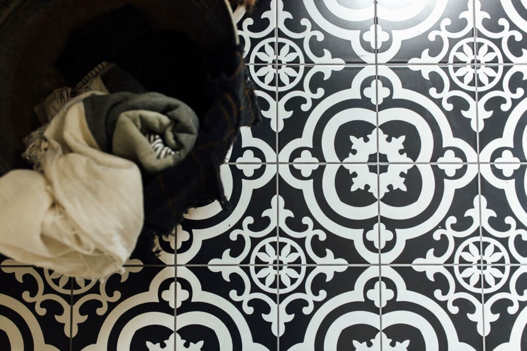
For the Towne Drive project we chose simple tile for the kitchen – a marble style tile. In the bathroom we picked out a matching marble tile, but instead of small rectangles we chose large squares, complimented by the small white tile in the shower. In the mud room we picked out a black and white tile with a busier design that fit the small room perfectly.
Railroad Masters House
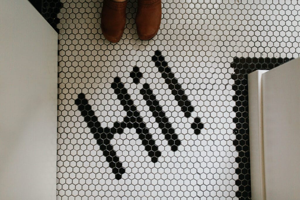
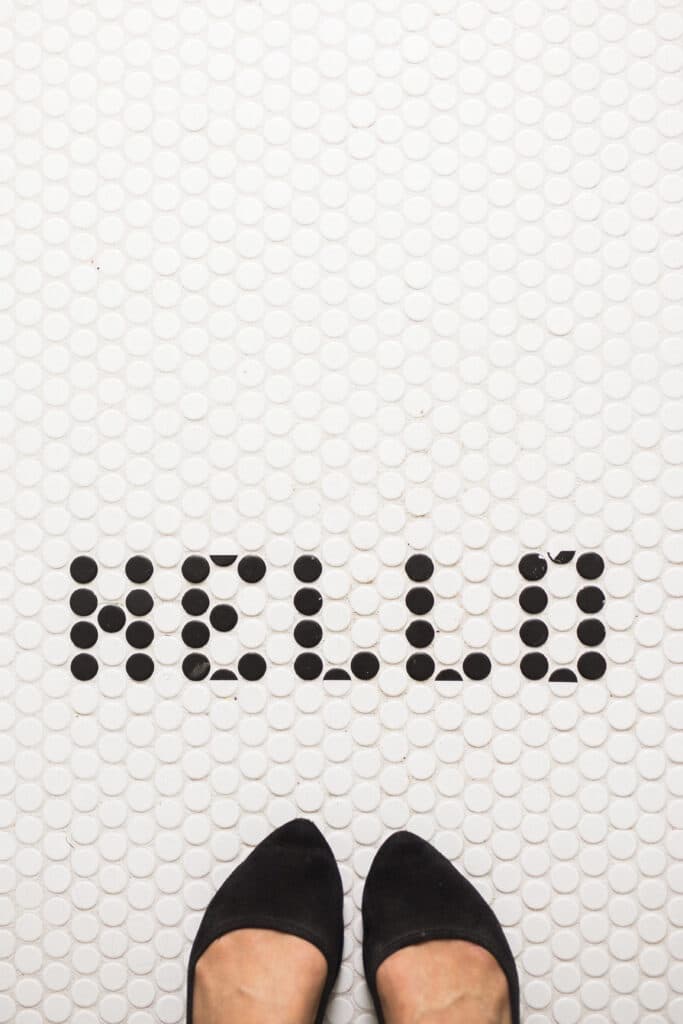
The project inspired by the heritage of the home. We chose a stately large tile for the shower with a marble look to it. The fun surprise of the home was the white and black penny tile we carefully designed to stay HELLO.
Walnut Street
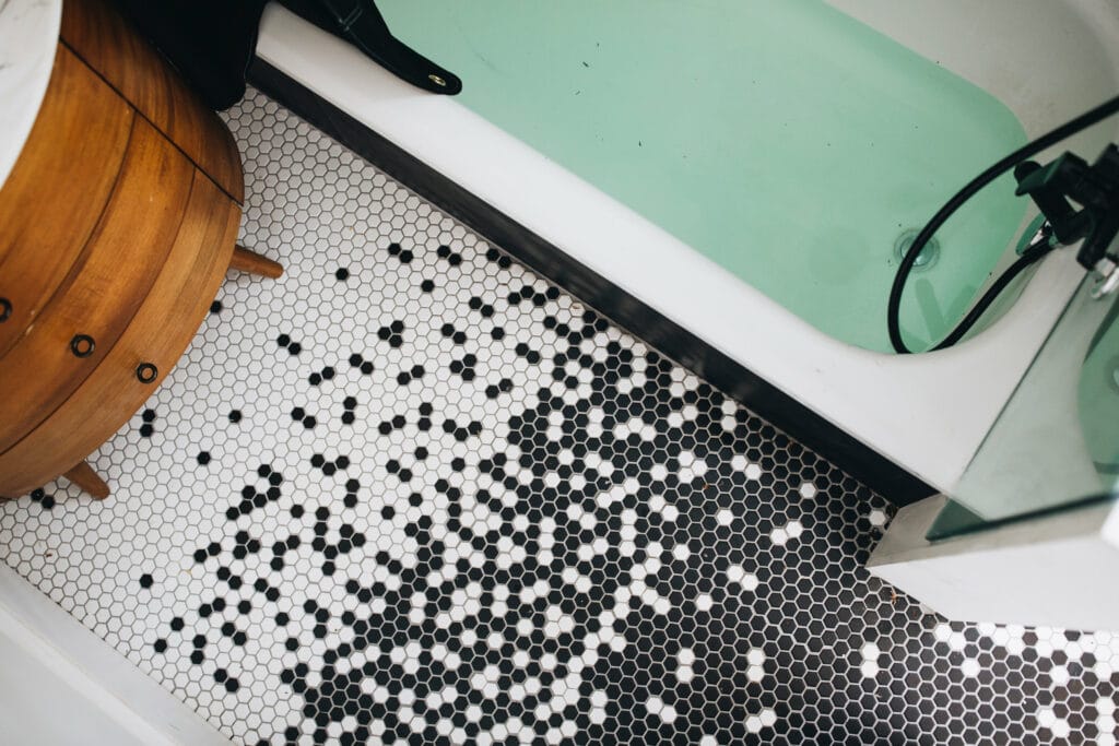
By now you should know that we love black and white penny tile – you can just do so much with it. A great example of how you can make simple penny tile look special is the Walnut Street bathroom where we laid the tile in a unique design where the white tile became black by sprinkling the black and white colors in as it mixed.
Whether you chose a bold tile style or a simple white tile. Perhaps you will pick a simple tile but lay it in a unique way to design something special. We love to help you pick out the details that you need to design a space that you love.
Want to work with us? Check out our page on where to start here.